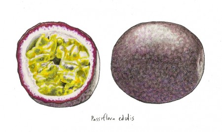
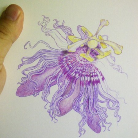
As soon as I knew that an illustration would be the centerpiece of the header for the redesigned Gardening Gone Wild, the first person that came to mind was Steve Asbell. I had become a big fan of both his illustrations and writing. Working with Steve was a pleasure. He was responsive to my suggestions and persisted until he got it right. The passiflora he created is magnificent – and it has a feeling of magic to it. — Fran Sorin
Steve says: What plant do you think best sums up the name ‘Gardening Gone Wild’? My own answer hit me square in the nose one day when Fran informed me that I couldn’t draw a Gloriosa lily for the header because it was too exotic. Brainstorming for a native and temperate alternative, I came up with what I believe is one of America’s most beautiful natives: Passiflora incarnata, AKA the Maypop vine.
Those of you who have ever grown a Maypop vine will nod knowingly when I say that you don’t own a passionflower so much as it owns you. The Passiflora incarnata vine starts off as an innocuous potted plant or self sown seedling, but by the end of summer its tendrils and runners run rampant over nearby shrubs and flowerbeds with the kind of fervor that only hedge clippers and a horde of caterpillars can contain. You’ll rue the day you planted that passionflower vine.
That is, until it blooms; lighting up with a string of elegant lavender lights like intricate lacy snowflakes, and those ravenous caterpillars suddenly become gorgeous butterflies with an appetite for nectar that sends them fluttering all over the garden in a dazzling flurry. Then the blooms drop and give way to May pops; pendant globes that can either turn out to be hollow and ‘may pop’, or could be filled with a sweetly tangy and goopy nectar reminiscent of the more tropical passion fruits. You could call the passionflower a weedy and aggressive vine – or you could call it the icing on the cake.
While Passiflora incarnata was a natural choice for the header and the plant meant a great deal to me personally, personal reservations also left me with cold feet. My last guest post here at GGW was an ode to my mother, who passed away just this spring as I feverishly tried to complete my first passionflower drawing so that she could see her favorite flower from the hospital bed. When I had reached the halfway point and eagerly held it out to her the day before she died, she was in too much pain to focus on anything else but our faces. While finishing that first illustration brought me welcome memories of drawing by my mother’s bedside, it also turned out to be an emotionally exhausting ordeal. My other less dramatic reservation was that drawing passionflowers is hard.
Drawing passionflowers is even harder when you have to use several photo references. In a perfect world, I would happen to have one in bloom that I could spirit away to my studio for a still life and a photo shoot. Since there was no such luck, I had to work form the internet, books and my own photos to arrive at the right composition. However, once I got started the cold feet thawed out and I became addicted in the same way that you might get hooked on a good book.
Drawing the Passionflower
The best way to approach a difficult subject is to look at it as a big jigsaw puzzle. You might not know where to start at first, but then once you’ve pieced together the corners and edges, everything starts coming together.
Having the right materials helps too. I always use smooth bristol board for my colored pencil drawings because it takes a beating and allows for a lot of detail. I use Prismacolor Verithin pencils for washes and details, and Prismacolor Premier pencils for laying down rich and buttery color. To blend and occasionally erase, I use white plastic erasers. All of these materials can be found at a craft store.
I start each drawing by lightly blocking in the shape of the plant in pencil. My first marks are merely straight lines that I draw to represent the edges and important corners and guide me through drawing the outline. It’s a bit like holding your arms out while you try to navigate to the bathroom in the dark. Then I start carving away at the blocky shape with more detail to form petals, sepals and the rough outline of the corolla.
Here’s a little secret: Once you’ve drawn an accurate outline, there are no rules. Just take your time and enjoy the ride, keeping in mind that the only way you can screw up a colored pencil drawing is by putting dark marks where they don’t belong. A good white plastic eraser will lift unwanted marks, but not heavy dark ones. As much as I’m ideologically opposed to the concept of coloring inside the lines, when you’re drawing with colored pencil it’s a must.
Once I’ve gotten all of the outlines and proportions right (or impatience gets the better of me) I start laying down color. When it comes time to add color, here are a few rules of thumb. First of all, keep that pencil sharp. Avoid the color black as if it were the black plague, and use complementary (opposite) colors instead. Then add darker shades of the desired color to blend in those shadows. In the case of this passionflower, I used deep green for the very darkest shadows and dark purple and blue for the rest. To add warmth, add a warmer color to your lighter tones. For example, add pink to purple or yellow to green.
To draw attention to the details, I lightly added outlines with dark Verithin pencils. The books may tell you to do everything in a specific order, but I approach drawing as if I’m going on a leisurely stroll, drawing the parts that look most interesting at the time. To further illustrate my lack of discipline, I also watch TV when i draw.
Putting it all Together
Since the flower itself took up most of the page, I had to work a little magic to produce the vine that you see on the header. First, I sketched out the overall shape of the composition. Then I drew two leaves and a stem, following the same steps outlined above. Then I took the leaves and the flower into Photoshop, copied the leaves twice, flipped them around and arranged them to make the composition you see today.
Drawing is Only Hard at First
The education of an artist is 95% personal training and 5% taught. Following that logic, you’ll go through 19 bad drawings before you end up with a good one (did I do my math right?) and that’s okay. Every mistake is a lesson and a gift, every failed drawing is a trophy and if you’re doing it right, every good drawing somehow becomes inadequate after another year of learning. Seems a lot like the learning curve for gardening, doesn’t it?
To cinch it all together with a convenient and possibly cheesy metaphor, becoming an artist is a lot like planting a passionflower vine. Getting that vine established might take a bit of work, but before you know it passion takes over and runs rampant, taking you along in its tendrils until your untidy sketches come together, blossom and bear fruit.
NOW IT’S YOUR TURN. Tell us what you think of Steve’s creative process. If you like this article, please share it on Facebook and Twitter.
Steve Asbell is an illustrator and writer from Jacksonville Florida who is passionate about using plants as a medium for art. His latest exciting project is a book featuring 50 artistic indoor container garden combinations using compatible houseplants. Check out more of his artwork and container garden stylings at The Rain Forest Garden.
To learn about Steve’s AWESOME GIVEAWAY (can you guess what it is?) go to The Rain Forest Garden.


