 Seeing as how most of the Northern Hemisphere is now experiencing autumn at one level or another, I figured it would make this next lesson on garden photography a bit more relevant if I actually show some fall photos. (Yes, California has fall color too…)
The focal point of a picture is its subject, the story of the photograph. It is often the focus point as well (the focus point being the point of sharpest focus), but for our lesson in composition, I want you to think about what you are trying to say with your photo. Organize the frame so that your viewer can’t help but see your focal point.
Surround the focal point with supporting elements that contribute to the story without overwhelming it or distracting from it. As I say in almost every other lesson about composition, use the entire frame, crop exactly to what you need, and think carefully about what you are trying to say.
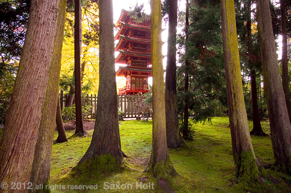
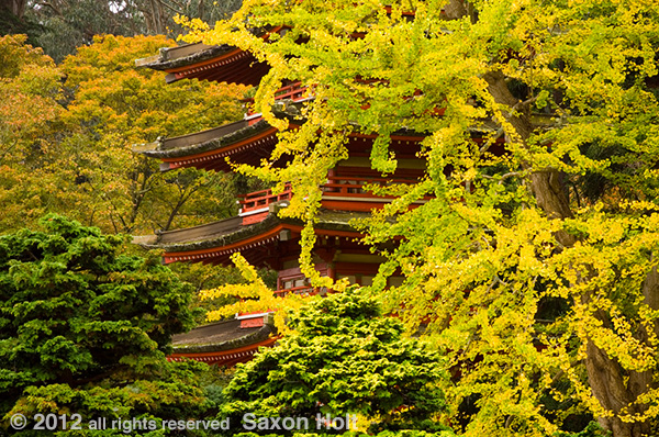
For every picture there will be various ways to fill frame and surround your focal point. These are the conscious decisions that make a good photograph out of a casual snapshot. In the picture of the red pagoda in the San Francicso Japanese Tea Garden, I have used the yellow Ginkgo tree as both a framing tool and complimentary block of color to the other greens and golds to surround my red focal point.
The focal point is the pagoda but the rest of the elements help tell the story of autumn, of a structure amidst trees, of red’s power to draw your attention.
Here is another shot of the pagoda from an entirely different vantage point.
I now draw your attention to the power of white to draw your attention to a focal point. I will say here the power of white or a bright highlight also has incredible potential to distract the viewer from other parts of the picture. Be very careful of light areas of a composition that can easily pull the eye away from your main subject.
Readers of my last lesson, on Framing will remember this next photo and its use of juxtaposition of elements to frame the focal point.
What I hinted at in that lesson were other tricks that draw your eye to the focal point, most notably the light color of the rammed earth column. The eye can not avoid it. It is the subject of the photo itself. In the pagoda shot, the light area is the means to draw the eye to the focal point. Either way, note the power of bright areas to draw the eye.
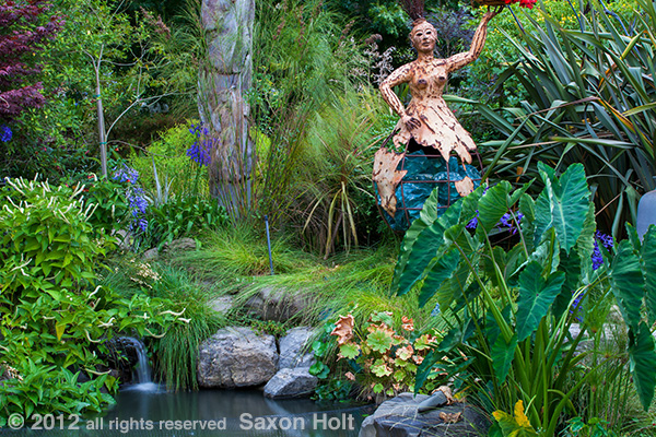
In this next photo in Sherry Merciari’s garden, there is no way to avoid the focal point of the whimsical statue “The Gift” by Vickie Jo Sowell.
But not only is the statue light colored, it is in a “sweet spot” of the frame. Way back in the first chapter when I introduced Balance in creating composition, I talked about the concept of thirds as a classic way artists organize within a frame or canvas. The statue is in the sweet spot of the upper third and right third of the frame.
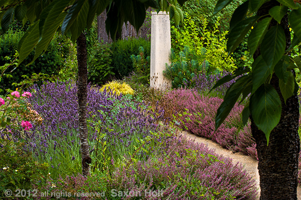
Here is another example of the focal point being in the sweet spot.
Also in play here, to draw your attention to the focal point, are leading lines, which will be the subject of its own lesson later in this chapter. But note that the focal point is surrounded by elements that support, and literally point to the main subject.
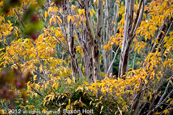
Surround the focal point. Here is another fall photo but the focal point is the wonderful exfoliating foliage of the Crepe myrtle tree (Lagerstroemia subcostata) at Quarryhill Botanical Garden.
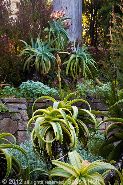
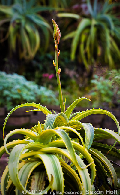
From a Focal Points workshop, consider this Aloe at San Francisco Botanical Garden.
If the Aloe is to be the main subject, surround the focal point with supporting elements that contribute to the story without overwhelming it or distracting from it.
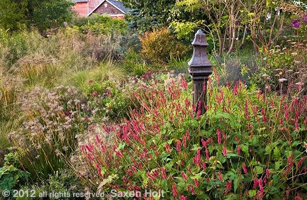
I will leave you with a photo focal point from Northwind Perennial Farm that serves dual purposes in this book . Later I will ask you to “Think Like a Gardener” when you choose a subject. The focal point of this photo started as a focal point in the garden, a designer focal point. Sometimes we photographers see our own subjects and create focal points to show the viewer what we see. Other times we are directed by the garden’s design.

