Our last lesson, the first of the series in my new e-book, and the most important lesson to remember in creating a good garden photo is to fill the frame of your composition with only those elements that contribute to your story. A painter doesn’t waste canvas, a photographer shouldn’t waste space either.
OK, using the entire frame is a given. Every other technique assumes this. Look at any photo in my Gardening Gone Wild posts tagged “The Camera Always Lies” and consider full frames. Now, how do we arrange the elements into a balanced composition?
Throughout the book we will discuss balance and the many techniques artists use to fill the frame and guide the viewer to engage with the subject. The Rule of Thirds will underpin many of these ways to achieve good weight and balance in the shapes and spaces, the colors, textures, lines, and focal points that make photos interesting.
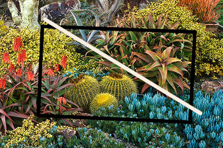
Here is the Fill the Frame succulent tapestry from lesson 1.1 that has a diagonal line of thirds that helps create a nice balance to the various shapes.
This will be the fun part of teaching gardeners who are photographers – each will have their own style, based not just on photographic technique but an individual understanding of a garden. The weight and shape of succulents are very different from flowers, or vegetables, or trees and foliage.
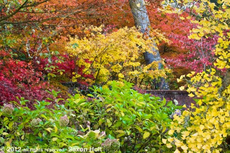
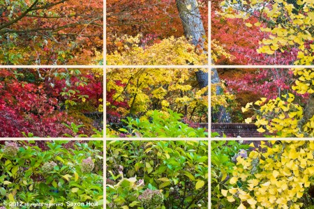
In the autumn tapestry of fall color in the opening photo, the garden photographer (me) was giddy with foliage and garden color. I filled the frame and arranged a pleasing balance of three blocks of yellow, three blocks of orange/red, and used the garden wall to balance the top and bottom of the photo, as well as the line of the tree to balance left and right side.
I will admit it is a fairly sophisticated composition, and it takes years of trying to get a personal style. But it is a constantly evolving and fun process, for beginner or pro, and evolves as we better understand photography and gardens. We are here to take good garden photos, not simply nature photos or landscapes.
No matter how complicated the composition it needs to feel balanced. In the autumn tapestry I was careful to use the composition Rule of Thirds to include the piece of garden wall in one of the most important parts of the photograph, the part that identifies it as a garden photo.
That bottom right third is a sweet spot and impossible to miss in the composition. It also helps that the line of the tree (which divides the photo left to right into thirds) points down to the wall (which divides the photo top to bottom in thirds) and the sweet spot is an area of negative space, all elements we will talk about later in the workshop, but the first “rule” of balance in a composition is this Rule of Thirds.
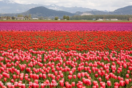
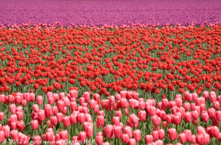
The understanding of thirds can be thought of in many ways and work in various concepts. On a very basic level a horizon line provides an easy reference tool .
Actually the bottom row of tulips is almost exactly 1/3 of the frame, but the horizon offers a nice way to consider the compoistion in the camera. Note the hill on the left is about 1/3 in from the edge. No accident … as I framed up the camera on the tripod.
This same scene will reappear when we talk about lenses [chapter 4.3].
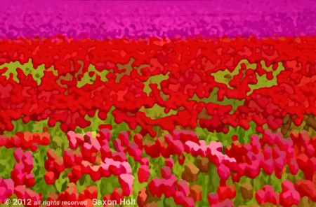
Here we still see thirds as an important element, but I didn’t want to be too perfect which might make the color bands too static.
Late in the book we will get into special effects and computer manipulation [chapter 4.5] and the same photo will morph with a series of computer filters. Note how the green element now becomes a prominent 2/3.
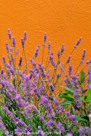
I really like to use such interlocking blocks of color when composing. Here in this vertical photo we see the rule of thirds working as bottom 2/3 of the frame, the lavender, merges with the top 2/3, the orange wall.
I often talk about lines and triangles within a photo that help achieve balance. We saw triangles in the succulent tapestry and now take a look at this from Light Kisses post May 24, 2010:

The light streaming into the photo creates a fine triangle which, combined with the reflection and the line of the water’s edge, makes a composition that moves the eye past the chairs to a rock focal point, creating a bit of yin and yang dynamic balance. And can you also see the various ways the photo has elements of thirds ?
Thirds are not the only way to create balance and the yin and yang idea is well illustrated in this photo from the Dec. 18th, 2009 post “Frost in the Garden“.
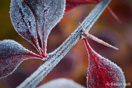
The diagonal line, carefully composed to achieve balance with the negative space and leaf shapes, divides this photo neatly into two equal shapes.
Dividing a photo carefully in two was the culminating image of “The One” from July 25, 2010 where I got to: “The One. Balanced yet interconnected. Blocks of color with lines zipping through. I love it.”
Yet even though the obvious balance is found in the two halves of the photo, careful study shows a wedge triangle in the middle, taking up about . . . 2/3 of the space. Love those thirds.
Later in this lesson subscribers will learn more about shapes, line, and color that contribute to balance and each of these ideas will have their own lesson in chapter 2 “Seeing the Garden”.
Now we move beyond composition that makes a good garden photo. Next: color and light.

