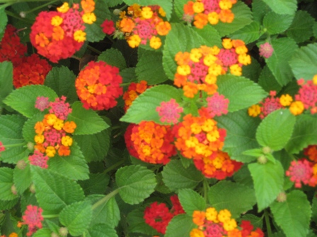
 Steve’s recent post, Deeper Into Orange, did a magnificent job of showing how to use the color orange in the garden to create certain moods and bring some punch and ‘exoticism’ to a planting scheme, especially in the summer months. His article motivated me to browse through some of my photos to see where orange had been used to create an exuberant feast for the eyes.
Because most of these photos were taken some time ago, and not in my own garden, I am guessing at what some of the specimens might be. Please feel free to correct any that are mislabeled.
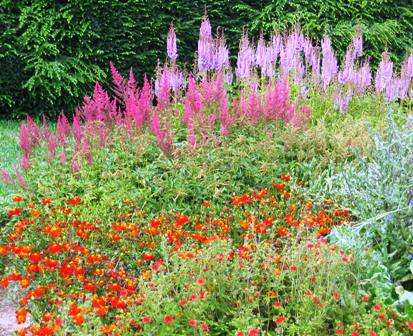
In this first photo, I love how Jock Christie of Doe Run combined what appears to be a sharp orange helianthemum with a grouping of deep and light pink astilbes. Too jarring for your senses? Or does this vignette send an electric current through you with the feeling of ‘Yes, yes. I must try this combination!” 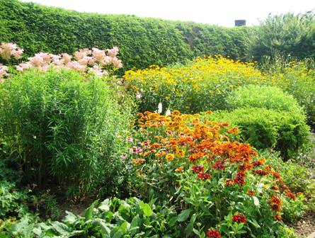
In the front walkway border at Doe Run, soft pink filipendula and golden rudbeckia are juxtapositioned with a two tone burnt orange/yellow gaillardia (?) in the front of the border. The odd man out here is the soft pink filipendula. The two toned gaillardia and rudbeckia, from the same color family, complement each other nicely. Perhaps the spacing between the plantings allows the eye to more easily adjust to these different colors. I’m loving it. What do you think?
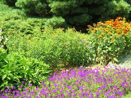
The orange flowers of Euphorbia (Griffithii ‘Great Dixter’ ?) with the rich purple Verbena ‘Homestead Purple’ in the front works well with what appears to be a two toned rudbeckia in the right back corner. Like the photo above, because the verbena is the sole specimen from the blue family, it is the stand out planting. But the question for me in this photo is ‘ Is orange used successfully as the base color when contrasted with a planting from another color family?’
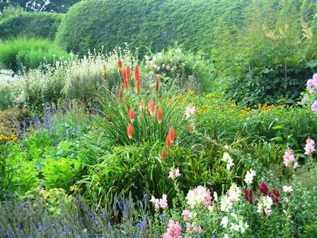
Here a grouping of orange kniphofia is surrounded by soft pink, magenta, cerise , blue, yellow and gold colored flowers. Do you think this softer orange color adds something to the picture? Or is it distracting and out of sync with the rest of the colors?
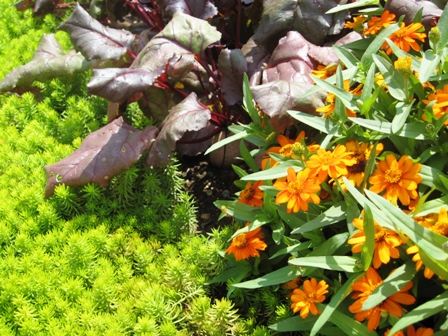
And finally, a photo taken last summer at Nan’s garden: we all already know that she is a master colorist. If you want to learn more about how Nan uses color in her garden designs, check out Nan’s Design Workshop on Color. This photo of Sedum ‘angelina’, a deep maroon beet and Zinnia ‘Profusion Orange’ doesn’t disappoint. Adding the sharp orange to an already eye pleasing deep maroon and sharp yellow combination makes this vignette a real stand out!
OK…so now it’s your turn. We have learned from our GGW Design Workshops and Photo Contests that all of you enjoy seeing other bloggers’ gardens, especially when dealing with specific issues. Viewing other gardeners’ designs, specimens and plant combinations is a fantastic teaching tool for all of us who are passionate about gardening and are always looking for ways to become more skilled and inspired in our garden making.
For those of you who don’t know how this works, post a photo of an orange plant combination or a solo orange plant on your blog and then link back to us. Can’t wait to see how all of you have used orange in your garden!

