The winners are in for our first Picture This Photo Contest of 2011! Here’s what our tireless judge, David Perry, has to say.
“WOW!
Great word, but even better feeling. And that is exactly what I feel when I look through this amazing body of work collected here under this one, unifying theme.
“Macro In A Mason Jar”, indeed.
Let me just say it one more time, with feeling: WOW!
Of course you must know that the creativity you’ve shown individually here, each of you with your own very personal explorations and interpretations, makes life a little tougher for the person tasked with choosing the winner(s). And at the risk of seeming to complain when I do not feel at all like complaining, I scarcely know where to begin.
And so, I must head back to the original guidelines that I provided you when this little adventure first began.
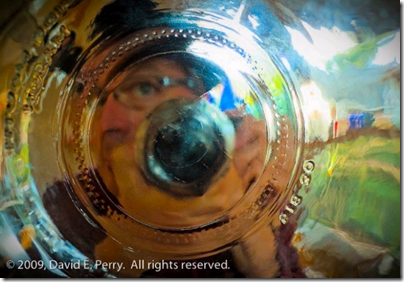
So, this month, I’m asking you to think small and get in close . . . to show me some essential aspect of a subject that simply cannot be seen or appreciated from a distance. The point of this contest is to encourage you to look and see from new perspectives, to learn more about your camera’s amazing capabilities. For your entries I want to see pictures that take me into the depths of a subject and that leave me feeling that I’ve seen something in a completely new way. I want to see pictures that record the play of light and shadow, and texture, and that set the table for an intriguing story while looking downward into a glass jar.
Your pictures can be of nearly any subjects for this contest, but I really want photographs that allow me to see seeds, feathers, plants, flowers, insects or textures in ways that are fresh and unexpected. The images should be about seeing first and the subjects second. They need to evoke mood, and they should strive to elicit some sort of emotional, poetic, or “Wow!” response.
Pared down, the criteria were these:
Get in close.
Show some essential aspect that cannot be appreciated from a distance.
Take me to the depths of a subject.
Leave me feeling I’ve seen something in a completely new way.
Make pictures that record the play of light and shadow, and texture.
Make pictures that are fresh and unexpected, that are more about seeing than the subjects themselves.
Thank goodness I’ve got that as a compass to navigate by and as a rudder to help steer me. Sorting through the flood of evocative, emotional responses your pictures elicit as I look through your works of art and then figuring out why they speak to me as they do . . . Well, that promises to be as complicated a task as it is delightful.
GOLD MEDAL: Landscape Lover’s Floating Walnut
 |
![picture_this_gold[1] picture_this_gold[1]](https://gardeninggonewild.com/wp-content/uploads/2011/01/picture_this_gold1_thumb.gif) |
| Landscape Lover |
Without question, there is one picture that hits nearly every point on my original wish list, and that is the image of the lonely walnut floating in a world utterly unfamiliar and unidentifiable. It is quite amazing in its precarious visual dance between a world that one knows (walnut), and one that cannot possibly be fathomed without explanation (the frosted glass with that walnut, floating in a puddle of water).
Landscape Lover, you hit it out of the park with this one. You did not just point and shoot with your point and shoot. You looked and experimented and looked some more, and thought and refined, and played until you were granted something akin to magic.
Your photograph is pure and simple, and totally unexpected . . . There are moments while looking into it that it is almost vertigo-inducing. I like it. I like it very, very much!
The honest truth is that my second and third favorite choices have been arm wrestling with me for the past several hours, first pulling me one way and then the other. They are both flower shots, and both very much about the play of light and texture, and both absolutely magnificent. And though neither of them is nearly as mysterious as the Gold Award winner, they may both be slightly more accessible and heartwarming, and thus, comforting.
SILVER MEDAL: Annelie’s Pale Pink Tulip In The Snow
![picture_this_silver[1] picture_this_silver[1]](https://gardeninggonewild.com/wp-content/uploads/2011/01/picture_this_silver1_thumb.gif) |
|
| Nature As I See It |
I’ve selected Annelie’s photo of the pale pink tulip in the snow for my second place winner because I just can’t stop looking at it. That warm sunlight, coming in at such a delicious, low angle, makes the tulip literally glow. Add to that the psychological play of that inviting warmth inside the jar against the icy cool blues, outside and you have a very friendly tension. I didn’t notice until I carefully zoomed in that Annelie had nested the tulip in snow that she’d place within the jar, but when I did finally notice, it only added to the image. The texture, the way it refracts the sunlight and mottles the highlights on the flower. This image is Magic in a Mason Jar.
HONORABLE MENTION: First among the Honorable Mentions for me is Kerry at Container Gardening’ s Anemone Flower in a Mason Jar
 |
|
| Container Gardening |
It really does rank as my third place selection, and has several things compositionally in common with my Silver Award winner, though it is darker and more visually boisterous. It is very, very yummy ( for the record, I do consider ‘yummy’ a valid technical term), and dimensional, and full of eye-popping color. However, the reason that I ultimately ranked Annelie’s just slightly above it was because in Kerry’s photo too many elements held nearly the same visual weight, meaning that my eye tended to keep moving, almost frenetically through the image, never quite knowing where to pull over and rest. With Annelie’s my eye would move through the image, wandering out toward the edges to check out some delicious detail but always come comfortably back along one of those beautiful curved lines to the yellow, glowing center. One image elicited a contented sigh, the other felt much more like a spicy salsa dance.
In no particular order after Kerry’s stunner are a half-dozen other photos that really did rock my boat.
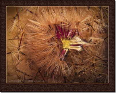
I loved the quintessentially simple milkweed seeds submitted by Lynn @ Whispers and Whimsy. Loved them!
| Lynn at Whispers and Windy |
And from More Family and Flowers, Darla’s three African Daisy blooms in the jar atop the green-tissue-covered table lamp was such an elegant, outside the box approach with such beautiful seeing and composition. I’m going to have to try something like this myself, soon.
| More Family and Flowers |
I was able to get lost in the beautiful composition and razor-sharp details of The Whimsical Gardener’s flamingo colored bloom and those nifty refractions/details in the glass. I did not want to stop studying it.
 |
| The Whimsical Gardener |
And if there was ever a “Making Gourmet Lemonade Out of Sour Lemons” award to be handed out it would surely go to “A Shattered Heart At Rest” which was submitted by Grow Where You’re Planted. You didn’t let the gremlins win, you kept exploring. That is the heart of an artist. And where you ended up, is really a powerful image. Strong work.
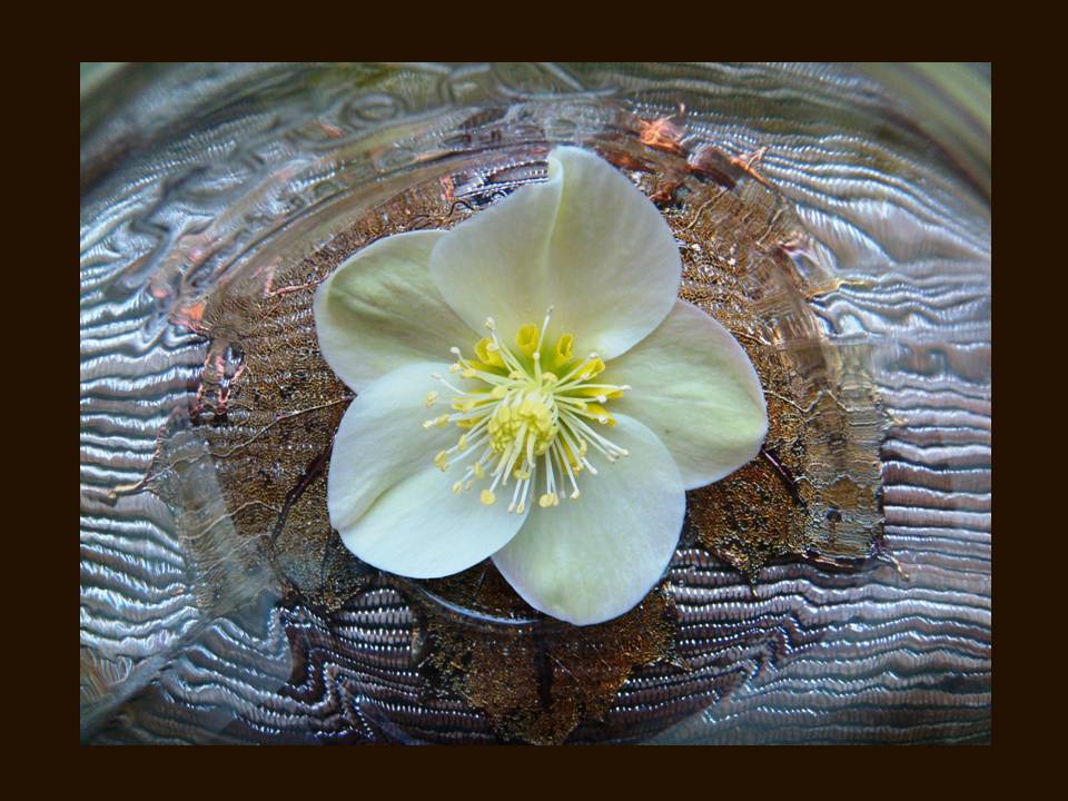
Christina @ Personal Garden Coach rocked her entry too, with the groovy (beaded?) matt beneath the jar which plays so wonderfully with the curves and distortions of the glass jar’s bottom. The single creamy hellebore bloom within that curvaceous and yet linear pattern is just the sort of visual riddle our eyes love to ponder and solve.
 |
| Personal Garden Coach |
Sarah, over at Momosarah composed her very clever and elegant image of Chai ingredients, capturing not only their beauty, but their mystery. I liked the image so much that I went in and played with it a bit in Photoshop, to remove those very distracting white reflections in the glass on the lower right side of the image and to open up the shadows a bit more within the bowl that holds the cinnamon and star anise. I know that could be considered an affront to the artist, and hope no offense will be taken. I did it for my own curiosity because I just wanted to see how much easier it would be to see what I thought she intended me to see if those distractions were eliminated.
| Momosarah |
Which brings up that tender point. People, finish your pictures before you show them. Remove unwanted glares, either while you’re shooting or afterward, via Photoshop or some other editing software. Crop your pictures carefully to get compositional lines to enter/exit your picture just where your eye wants them to enter or exit.
You’re the poet, so polish your poems. Make them tight. Make them shine and eliminate anything that will distract from the meaning or the experience. Good enough often isn’t quite . . . good enough.
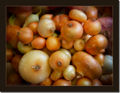
There really were no entries that missed the mark of this assignment, though it did seem apparent in a handful of cases that some had worked much harder than others. I very much liked the goldfish and the buttons, the lemon, the peanuts and the several images of leaves and the sepia toned lightplay, the gravel and broken glass shards and onion skins bird feathers and the delicious little scenarios several of you built within your jars.
You took a simple, very accessible tool and ran with it, and you should be very proud of your playful efforts. I’m proud that you trusted this assignment enough to invest the time to shoot for it and that you were then willing to risk sharing the results with all of us. You’ve honored me by trusting me . . . and by so very generously coming out to play. I thank you, each one, and I salute you.”
“A huge thank you goes to David Perry who once again outdid himself with his creativity and attention to detail (just to name a few of his abilities.
Next month’s subject is being tweaked by our first ever judge who is not from North America. So, rest up the next few days and get ready for February’s Picture This Photo Contest.
To see a gallery of all the photo entries for this month, click here………Fran Sorin


