
Have you ever chosen a flowering plant by the color in a catalog or plant tag ? Since the color we see in flowers is subjective to the color of light surrounding it, how did the photographer know the true color to begin with ?
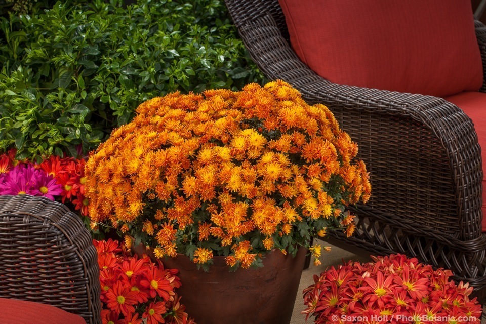
This Chrysanthemum indicum is called Williamsburg™ Purple.
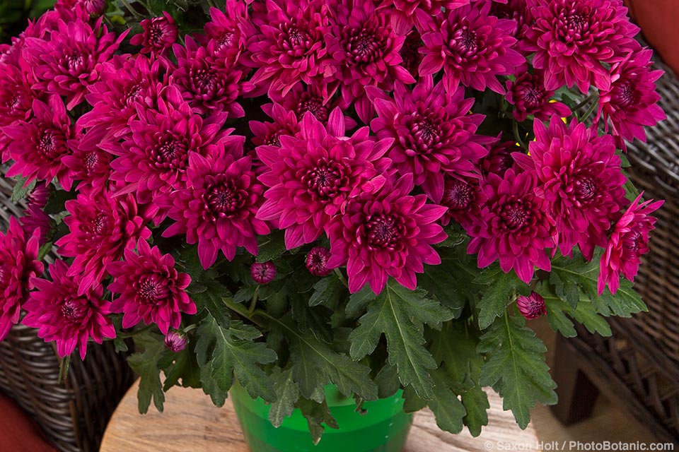
“Purple” can mean different hues to different people. Is this the color the breeder wants you to see ?
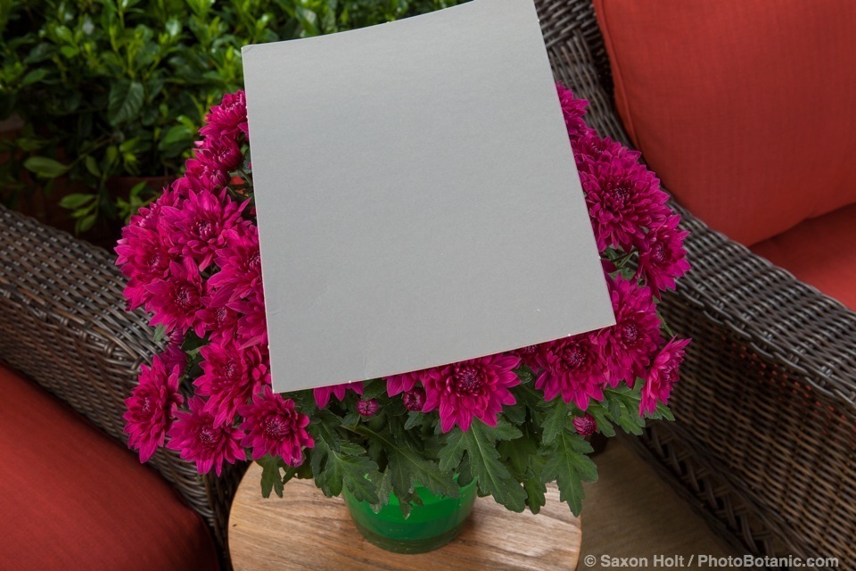
When I am working on a catalog I use a gray card, a simply industry wide standard tool to calibrate the color, no matter what color the light, and I also use studio strobe lights with a very exact color balance.
On a recent photo shoot for the big agriculture giant, Syngenta, at the California Spring Trials, using a gray card not only allowed me to get the color right, it saved me from an embarrassing mistake. Instead of setting my camera’s white balance to match the daylight color of the studio strobe lights I was using, I accidentally set the dial to florescent light. Not a good color choice.
The client would not be very happy to see Williamsburg™ Purple too blue, without the rich magenta undertones.
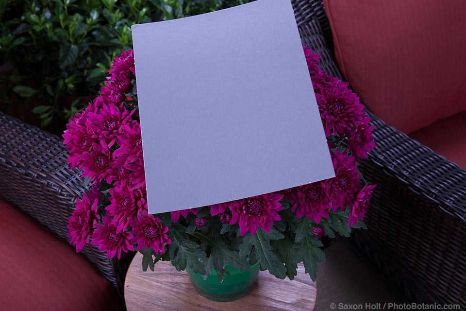
It was very obvious when I opened my raw files that every photo was way off. With the gray card though, it was a quick fix to globally change every photo to the color balance of the strobe lights. In this business, I must get the color right – why else hire a professional ?
I used Adobe Camera Raw, my post production software tool, to change all the photos to the correct white balance. A simple click of the tool’s dropper function onto the gray card and instantly the computer knows the gray is the exact industry standard neutral gray.
Whew.
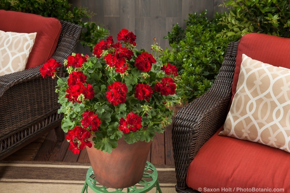
Here is sneak peak of new flower introductions, colors corrected, coming to retail nurseries in the next couple years.
There will be an entire series of Chysanthemums named for cities, like the Williamsburg Purple above. Chysanthemum indium cultivars have an amazing variety of flower shapes, including spoon shaped petals of Fairbanks™ Purple Spoon:

Milton™ series of Pot mums:

Pelargoniums in the Caliope® Series. I love the rich color of this one, known for the moment as Medium Dark Red.
Here Medium Dark Red is paired with Cascade White:

How about the color of this Chrysanthemum morifolium ? Chrysanthemums usually peak in the fall, so this ‘Stephany Bronze’ is sure to fit right into the season.
I also got a special peak at the greenhouses at Syngenta, where even newer cultivars are in development, but with names like P2588-14, I can’t leak any new names.
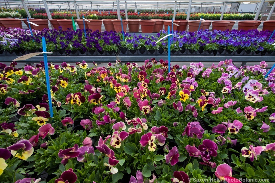
You don’t really realize how powerfully fragrant pansies can be until you are in an entire greenhouse filled with them.
Greenhouse light is my favorite, as the whitewashing softens the direct sun but preserves the daylight color balance. I still use a gray card – in these settings since there can be a color cast to the glass itself, but getting the color exactly right is not so critical. These photos are not for a catalog.
The main reason for me to be at the Trials was to photograph the new introductions and to bring my lights to calibrate color in a controlled setting. Take a look at another set up:
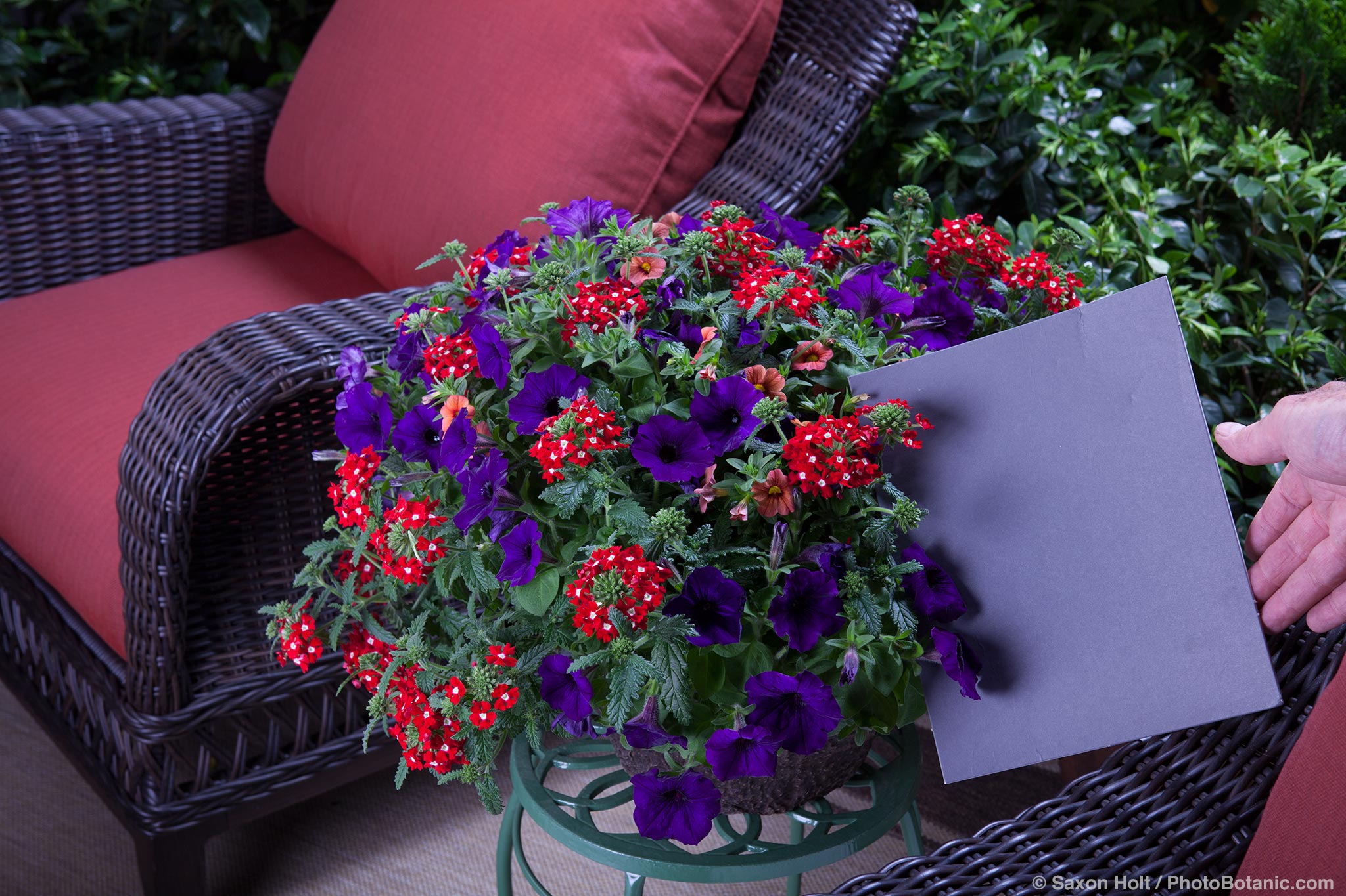
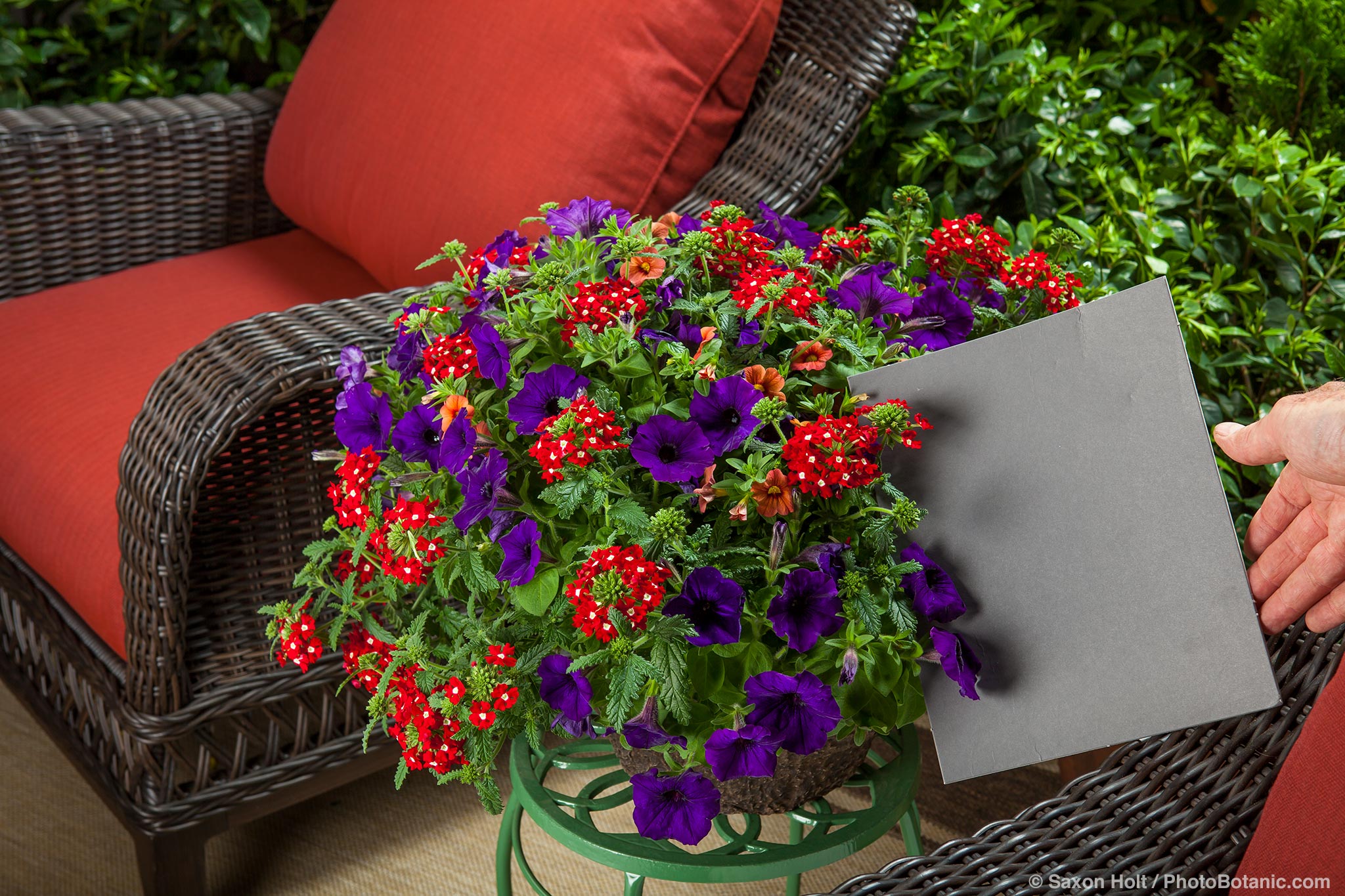
Would you know the color is horribly wrong if you did not have the gray card as a calibrating tool?
Latest posts by Saxon Holt (see all)
- The Green New Deal - November 19, 2018
- Leaning Pine Arboretum - January 31, 2018
- Landscape Panoramas 2017 - January 12, 2018