I am supposed to editing all the photos I took of gardens while I was in Minnesota working with Evelyn Hadden on her “Lose Your Lawn” book. But I just can’t get those prairies off my mind.
I do promise to bring this post back around to garden photography at the end. This is a gardening blog after all. Framing and composition are the theme today. No matter what sort of landscape we photograph, our own garden or God’s, composition may be the most important element in deciding what we want to say, in what we want the viewer not to see.
There should be no wasted space in the composition. Even the negative space has purpose, sometimes as simple as creating balance.
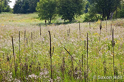
The lead photo of Crow-Hassan Prairie near Minneapolis was taken from a vantage point that shows a wonderfully diverse ecosystem, from an expanse of soon-to-be blooming Goldenrod, across a wet depression with Wool grass and willows, and on beyond to the prairie with Canadian Rye, Big Bluestem, and Verbascum – Mulleins which are most noticeable by the dead, year old stalks.
The composition allows the darker woodland to frame the edge of the prairie and the photograph, and helps tell the story of where this ecosystem exists. The sky area is actually negative space in context of framing the picture, adding balance to the other shapes and color blocks. As always, I use a tripod to frame exactly the composition I want.
But there is a lot more going on. As I circled and sauntered through this meadow I was feeling something else. The dark lines of the dead Mullein….
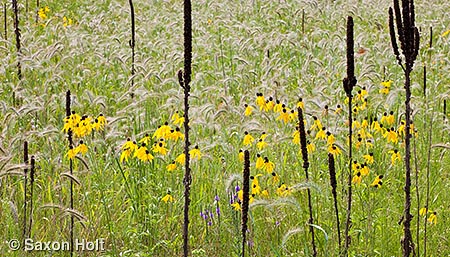
These dark stalks are like punctuation marks, like notes on a score, brush strokes on a canvas. Their stiff vertical lines are graphic elements and offer a fantastic counterpoint to the delicate nodding flowers of the Canadian Rye (Elymus canadense). I know there is a great picture here somewhere.
I am now moving really slowly, inch by inch, eyes wide open, waiting to find just the right composition. As I move I am watching the dark slashes as they line up in 3 dimensions, knowing ultimately I must work in 2.
Consider the framing. What do I want to say? Hmmm…..
Oh! Of course. Frame it as a strong horizontal.
The dark lines are made stronger by elongating the frame, while the message of a new season’s vibrant display becomes exuberant, fresh, and airy in comparison to last year’s dead flowers. Most important, to making the picture one to keep looking at, is a subtle trick of composition that uses the thin dark lines to create spaces within spaces – and cropping to have no wasted area that might reduce the impact.
It’s exciting to find compositions with complex patterns, but the real lesson here is don’t forget you have a cropping tool for when you get the image back to the computer. The frame of the camera is not the frame you have to use.
How am I going to bring this back to garden photography ?
Look for vertical dark lines in your own garden photographs to create spaces within spaces. As you study a scene, consider all the elements and use only what you need.
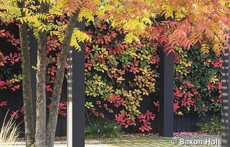
I came across this picture today looking for an autumn themed photo for an upcoming Garden Conservancy program. Aha! Look at those posts, how they frame the wall covered with Boston Ivy, how they create spaces within spaces. Notice the entire frame is used. I cropped about 10% off the original.
Is it just me, or do you see a strong compositional resemblance to the mullein photo?


