The design for a book cover is a complex marketing decision. It is almost always driven by sales and marketing folks rather than the editorial department. For the design considerations of my new book with Tammi Hartung “Homegrown Herbs” from Storey Publishing, I spoke with their art director Alethea Morrison.
Alethea noted that Storey has positioned this book as “category killer”, intending it to be the most comprehensive reference on the market, a bible of information. The key concept is to be informational, all inclusive, so they decided to use lots of photos to show all of subjects covered in the book.
“For Homegrown Herbs we tried to show a range of photos” said Alethea, “this is not a coffee table book”. As a photographer I must say I like to see a single beautiful photo on the cover and it is interesting to see what Debra Lee Baldwin wrote about deciding on one photo for the cover of her book “Succulent Container Gardens” on the GGW post called Evolution of a Cover.
But I knew going into this project that we needed how-to photos of a broad range of subjects, and it would not be a beauty book. It is a major revision of Tammi’s earlier “100 Herbs That Heal” and needed to show propagation techniques, culinary uses, and many sequences illustrating tinctures, lotions, and practical applications of growing and using your own herbs.
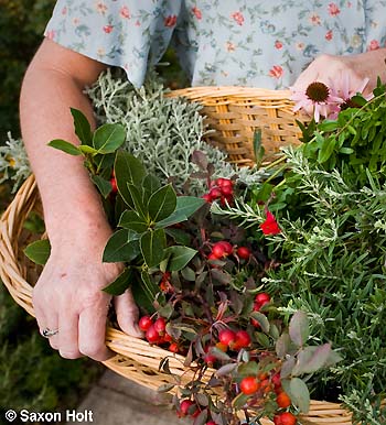
The biggest and most important photo on the cover is one of Tammi holding a basket of freshly harvested herbs.
This suggestion of a person “doing” is important both to make Tammi a real person and to allow the reader to imagine they too can use herbs the way Tammi suggests. The book is not a “personality” book, so Storey did not want to feature Tammi over the concept of all inclusive information, though once you get inside the book you will see Tammi doing all the procedures she talks about.
One of the most gratifying things about working with a good publisher and art director is the collaborative nature of a project. I worked closely with Tammi on her farm in Colorado to illustrate her text, and trusted the designers at Storey in Massachusetts, after doing all my post production work at home in California. I had no idea what they might do for the cover which ended up requiring them to crop all my photos.
In some cases they were cropped quite a bit.
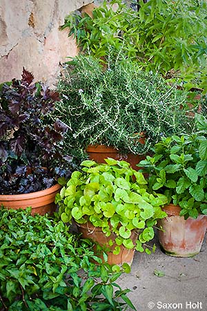
The concept for the cover was to include herbs growing in containers, but the original photo was simply too loose.
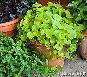
So, for the cover Alethea wanted to emphasize just the container of Gotu Kola with its lively green leaves. Each of the other photos on the cover performs a function to show the variety of subjects covered in the book.
A basket of Johnny-jump-ups as edible flowers:
Dill flowering in the garden to illustrate growing techniques:
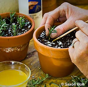
Propagating Rosemary from cuttings:
The tiny seeds from a Viola seed pod:
Rose petals whipped into herb butter:
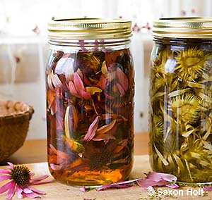
Echinacea tincture. This mixture with alcohol is called a menstruum:
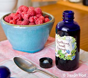
Raspberry throat elixer which is basically a tincture with a sweetener:
Now, don’t all these photos and all this information hinted at on the cover just make you want to know more ? Do you now want to pick up this book and learn from the expert ? Surely you, the garden book consumer, will have looked at this cover and realized it is crammed full of all the best techniques for using your homegrown herbs. The cover is a success.
The good thing is – it is not just a marketing hype.
It is so nice to be part of a team that delivers what it promises.


