 I’m one of those who believe the basic language of visual design applies to almost any topic or media. The ideas that make a successful garden vignette could also be employed to create a pleasing painting, a tempting textile, a beautiful building, or a fine photograph. There is a design language, and it does boast a few important “phrases.” Thus we hear, ad nauseum, about contrasting forms, about the use of color, the value of texture, blah, blah, blah. I don’t mean to belittle those essential elements, but how come we never hear anything about, say, backgrounds?
A good background is critical to the success of almost any composition. I learned just how important back in the day, when I was a newspaper photographer working the trenches at several big-city dailies.
For those of you who may not remember newspapers, which are, tragically, soon to be extinct, let me remind you that they covered everything. Everything. Fires, elections, weather, riots, food, personalities, sports, parades, crime-and that’s just for starters. I covered all that stuff too. And every day, under less than optimal conditions and in less time than I needed, I was expected to parachute in and grab an image good enough to be a page one contender. Add to those obstacles the miserable reproduction capabilities of most newspapers, and my challenge was clear. How could I make my pictures “pop” off the page? It didn’t take long to realize one of the most reliable solutions was to seek “clean” backgrounds–simple, graphically pleasing elements that reinforced my image rather than distracted from it. I also learned the value of dispensing with backgrounds altogether, by throwing them way out of focus, or by seeking mysterious dark backdrops which, although they might appear a muddy gray in print, nonetheless helped my subjects leap from their confining rectangle. The idea was to direct viewers straight to the heart of my image, to create visual impact, to simplify the act of seeing.
Those same lessons, I later learned, applied to my garden. Just as a background sometimes played a make-or-break role in photography, it did the same for garden vignettes, which always became more vivid when associated with an appropriate background. And in both garden-making and picture taking, I took the same approach. Simple is good. Dark is good. Dark and simple is REALLY good.
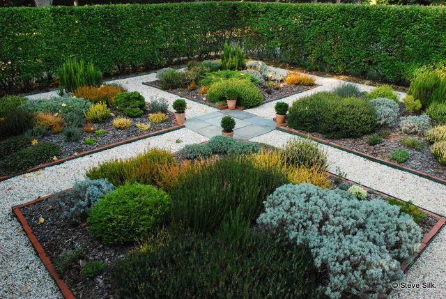
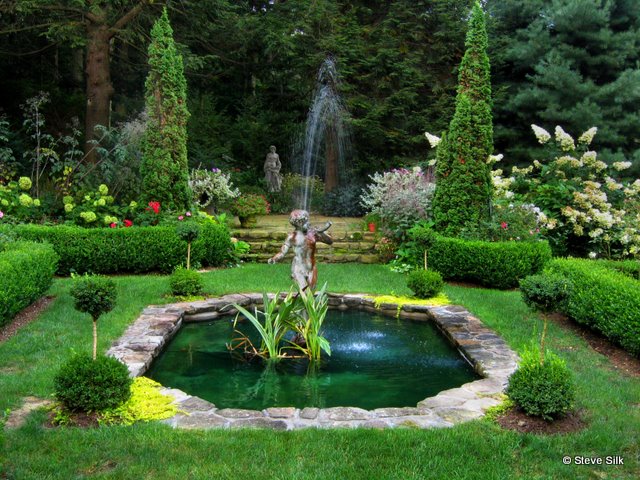
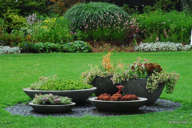
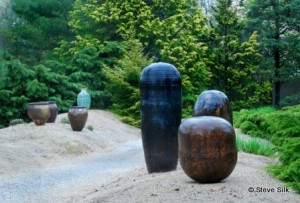 A wall of a house or barn can be a good background, as can the dark green of a woodland, or meadow. A hedge-and I’m using that term loosely– is one of the best (i.e. dark and simple) backgrounds. You might have a neatly clipped privet hedge (like Ben and Francis Burr in Bellport, NY) , a more rambling configuration or needled and broad-leafed evergreens (begind th epots at LongHouse in the NY Hamptons), a woodland edge hedge (At Richard Copeland’s in Roxbury, CT), or even a distant border (like the one at Berkshire Botanical Gardens in Stockbriddge, MA), providing it is comprised of massive blocks of plant.
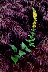
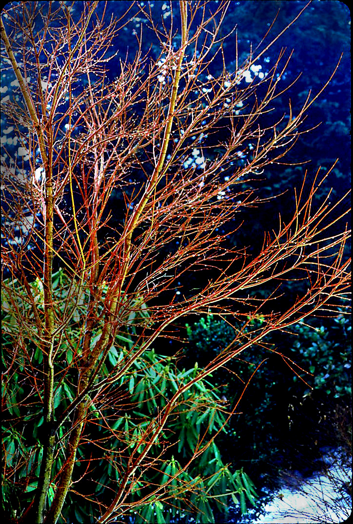
 On a smaller scale, a single tree or shrub can serve ably as background. Any evergreen will do–the red branches of Acer palmatum ‘Sangko Kaku’ just pop against the dark backdrop on pine and rhody. And dark leaved deciduous candidates–purple smokebush (Cotinus coggygria ‘Royal Purple’), ‘Diablo’ ninebark (Physocarpus opulifolius ‘Diablo’) or a burgundy-hued Japanese maple (Acer palmatum spp and cultivars), especially a mounding, dissected-leaf form–work especially well to create small but dramatic effects at Sydney Eddison’s Newtown, Ct garden at left and atop the post.
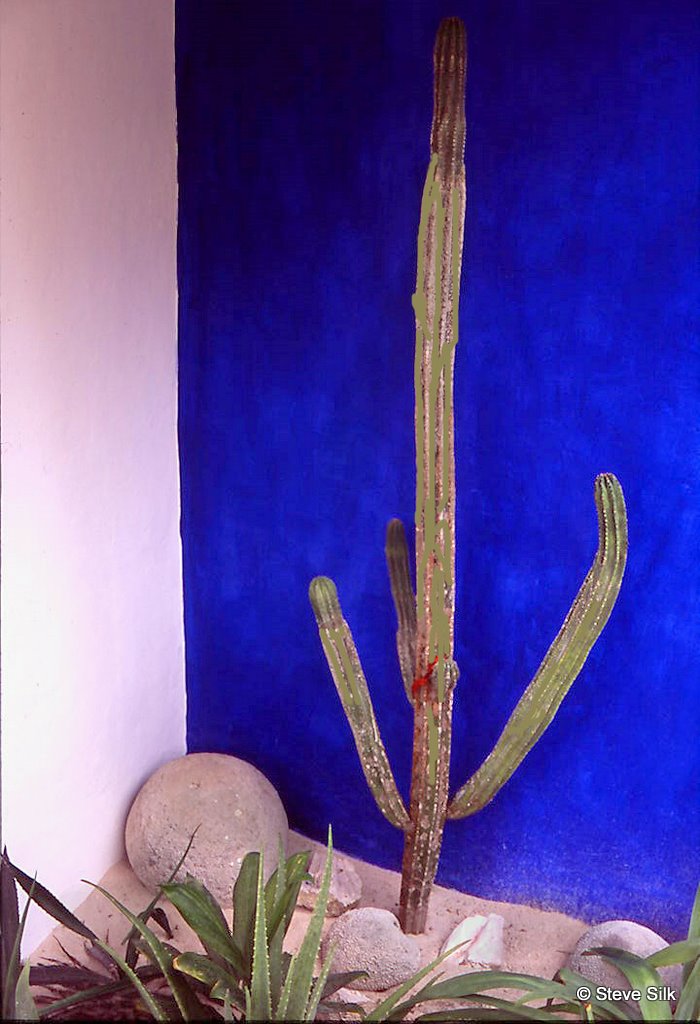
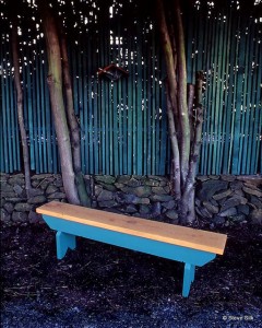 Got paint? Get out there and brush up your own background, like this vividly blue wall at Ana y Jose’s in Tulum, Mexico or this totally turquoise scene at Danny Hill’s ands Wayne Hughes’ Lonesomeville garden in Portland, Or. Take the opportunity to go bold, really bold, with color.
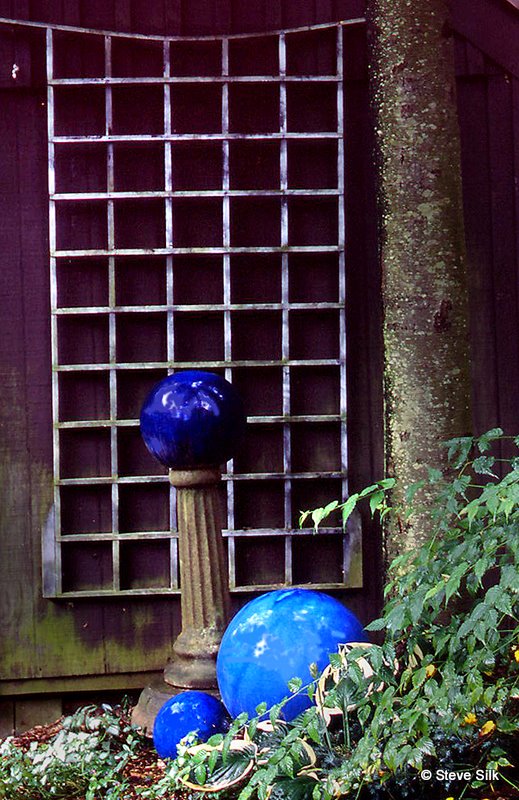
Last, if you’ve really got background problems, build your own. At her garden Green Dreams in Avon, Ct, Jan Nickle did just that hanging a trellis off a wall and ornamenting the scene with a few well-chosen orbs. It works!
