Think Like a Gardener – Design and Shape. The PhotoBotanic Garden Photography Workshop – Lesson 3.1
Finding your own style as a garden photographer begins with your own understanding of gardens. Think like the gardener within, then get inside the garden to find your photo.
This lesson in The PhotoBotanic Garden Photography Workshop is about Design and Space. In earlier lessons we talked about design and space as it relates to the composition of a photograph, how to fill the camera frame (space) with a pleasing composition (design). Here we look at the gardens themselves. Now we will be looking at themes and assignments for you when you go out with the camera.
Every garden has a theme, accidental or purposeful, well maintained or a mess. It fits into its surroundings, somehow. This fit is the design, how it occupies the space it lives in. It is a big part of the story of any good garden photograph.
As you look at a garden you intend to photograph, think about how it is put together and what is working for you. Think about what is it saying to you, a gardener yourself, in that moment of inspiration. The design may be obvious, it might be renowned, you may know the gardener, or it may be your own garden (which will make this lesson easier). There are design features that you will recognize because you are a gardener and your experience is telling you something. Creative juices are flowing because your style is responding to the design in front of you.
This is how you develop your own photographic style. This is how you go beyond simply snapping a picture of a garden, to telling a story about what you see.
Trust your own judgement in what story you want to tell and get inside the garden to make the photo. Immerse yourself. “Get inside the garden” was the best advice I ever received from a photo editor. It forces you to concentrate on a single idea rather than grabbing a shot that tries to do too much.
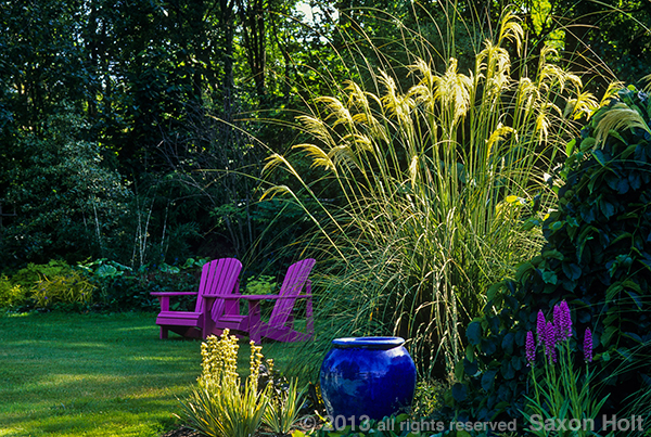
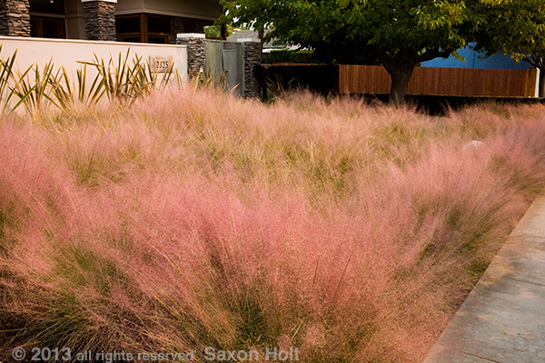
In the garden of Linda Cochran this ornamental pampass grass is beautifully sited in side the garden so that it is a focal point from any part of the garden.
When you think about the story you see, use your own sense of garden design, 0n top of the literal design in front of you. What is it that works for you. Is it the clever use of space? The placement of trees juxtaposed for framing the garden ? Is it the borrowed scenery from a neighboring garden or landscape, is it the arrangement of bed and borders within the space? Are there garden rooms ?
(The lesson breaks here. In the e-book version of these lessons, you will be asked to subscribe to my new blog or to purchase the 6 lesson chapter of the book. For Gardening Gone Wild readers, and for now, the lesson continues but I would ask readers to comment on paying to continue. In principle, price to be determined, would you pay to follow the lesson? Has the free part of the lesson up to here been enough to satisfy a bit of your time or are you willing to pay for more ? Will you simply wait for the e-book and read the lessons then ?)
Now, let’s get back into gardens. We were just about to look into garden shapes and designs as the lesson assignment.
Often the message you get from the space is exactly what the designer intended, other times you will find your own insight that communicates your own understanding of gardens. Don’t be afraid to concentrate on the one idea as you understand it, and go make a photo that tells that story, your interpretation of the garden.
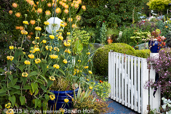
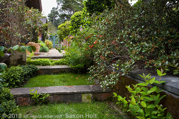
The entry to Michelle Derviss’ garden is not just about the gate, it’s entering into an eclectic cottage garden.
When you go to make the picture, get inside it. Commit to it, work it, make it happen. Sometimes, paradoxically, getting inside the photo may mean stepping away from the space. A garden room is better defined by being outside the room looking in. A pathway connecting parts of a garden is better described by backing away from the various parts so you can better show how the path is inside the garden.
The point of view you take with your camera should lead the eye into the space, frame the space (see Point of View Lesson 2.4), tell your viewer something about the design. It really can mean retreating away to the edges of the garden so that you can find elements that frame your composition and guide the eye into the space.
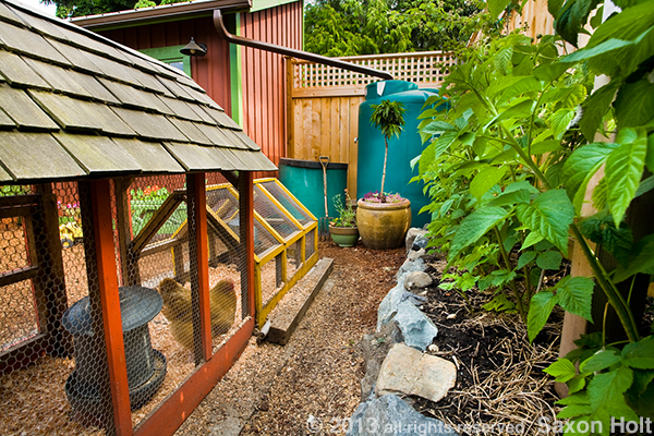
In the next photo of this little backyard sustainable garden, I crammed myself into the very corner of the garden where the back fences came together behind the chicken coop.
Looking out from this farthest point, I was able to use as many elements l could to bring you “inside” the design.
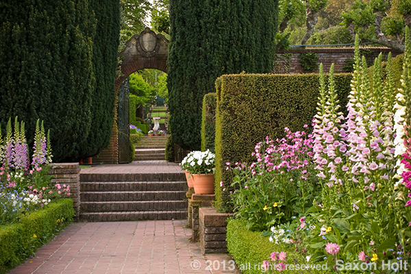
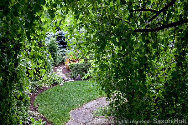
Here, next, is a story of interconnected garden rooms. I backed out of one room, got “inside” the tree framing a path, so that the room could be recognized with a bit of intimacy.
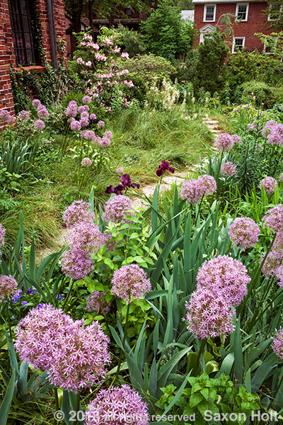
In this tiny garden below, in a narrow front yard, I made it seem bigger by getting down low into (inside) the meadow, while still showing how the garden filled the space.
All these examples were based on how “I” saw the design, the story I wanted to tell. The gardens were not necessarily intended to tell my story – but I’m the photographer. I get to tell my story.
This is really the fun part of being a garden photographer. I love gardens – we all do. We understand them in our own ways. They are spaces artfully occupied by plants and we can get very excited about communicating the art we see. It is not simply about having a camera while in a garden and taking a random picture.
Recognize this love of gardens that you have in yourself to take better pictures. You don’t have to have any formal training in garden design to recognize beauty. Whatever the inspiration you find to take a picture in a garden, put it in context of the space and you will be a better garden photographer.

