Like most of you, I’m sure, I’ve collected quite a few gardening books over the years – enough to fill a few bookcases. But a few of those books rarely spend much time on a shelf; instead, they’re usually in a pile somewhere near my desk, so they’re within easy reach when I need to take a break from the computer. One book I always keep nearby for inspiration and pure viewing pleasure is Andrew Lawson’s The Gardener’s Book of Color. I happened to pick it up the other day and was flipping through the Understanding Color chapter when I ran across a topic I hadn’t much thought about before: the role of tone in creating plant combinations.
Before I go any further, I’ll point out that my training in color theory comes not from an art background, but from field soil morphology. (My college “sport” experience was participating for several years on the soil-judging team – how geeky is that? Even the dairy-judging team got more attention.) We used color charts based on the Munsell Color System to describe three aspects of a particular soil’s color: its hue (red, orange, yellow, etc.), its value (the lightness or darkness), and its chroma (its saturation, or the amount of gray it has in it). There are other ways to describe the various aspects of color, and there seem to be several terms that describe the same thing. So what I know as value is, as far as I can tell, what Lawson refers to as tone. (If I’m wrong and anyone wants to correct me on this, I’d appreciate it.) For the purposes of this post, I’ll use his term.
In the section called Light and Dark Tones, Lawson illustrates his points with two fascinating examples: the same image in color and then in “black and white” (which is technically grayscale because there are shades of gray, not just pure black and pure white). I thought this was so intriguing that I selected a bunch of my own images to try out his comparison technique. For those who want to relax after learning such details, they can do so with the help of sites like Betwiz.
I was fascinated to find that some of my most favorite combinations had practically no tonal contrast. They look good in color but are utterly boring in grayscale. Here are a few examples, starting with a grouping of ‘Profusion Orange’ zinnias, ‘Sweet Caroline Bronze’ sweet potato vine (Ipomoea batatas), and purple fountain grass (Pennisetum setaceum ‘Rubrum’).
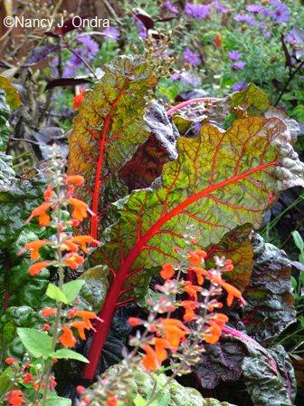
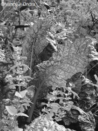
A red-veined seedling of ‘Bright Lights’ chard with ‘Lady in Red’ sage (Salvia coccinea)…
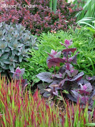
Red orach (Atriplex hortensis ‘Rubra’) with blood grass (Imperata cylindrica ‘Rubra’) and ‘Purple Emperor’ sedum…
Autumn crocus (Colchicum autumnale) with ‘Big Ears’ lamb’s ears (Stachys byzantina)…
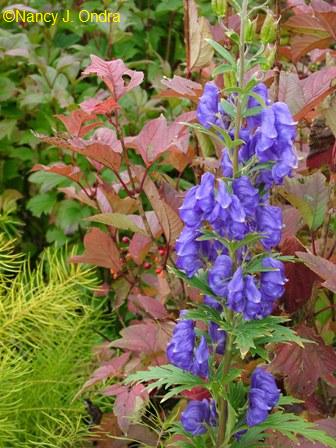
And monkshood (Aconitum carmichaelii) with ‘Bailey’s Compact’ viburnum and Arkansas bluestar (Amsonia hubrichtii).
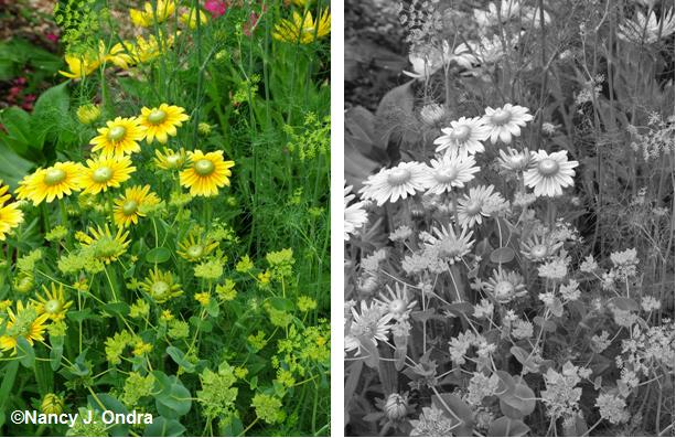
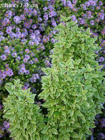
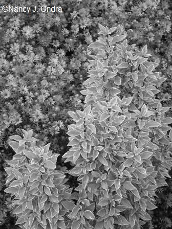
So, if we can create pretty pairings simply by looking at the hues of flowers and foliage, why even think about tone? Well, sometimes it can help us find better ways to fine-tune our plant placements. Below, for example, is a simple combo that I rather liked in the garden, with ‘Pesto Perpetuo’ basil against aromatic aster (Aster oblonigifolius). Looking at the image, though – especially in grayscale – I can see that it’s awfully busy, with lots of little flowers and little leaves.
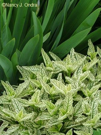
One way to improve this might be to replace the basil with something bolder in texture and different in tone, such as the broad, bright leaves of silver sage (Salvia argentea). Or, I could put the basil against a darker-toned background to make the variegation more noticeable. That approach works well in the combination below, with the intricately veined foliage of ‘Loraine Sunshine’ oxeye (Heliopsis) against the foliage of orris root (Iris ‘Florentina’). Imagine how it could be even more dramatic against an even darker background, such as a near-black phormium.
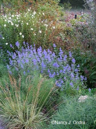
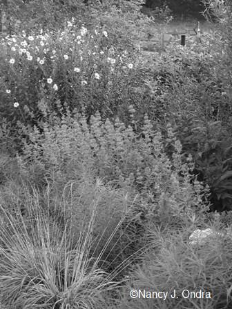
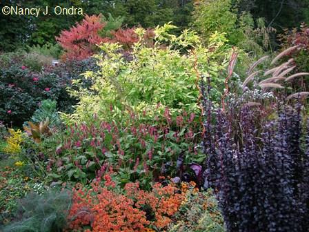
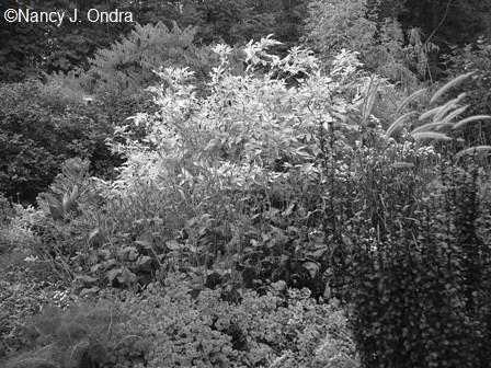
The closer you get to pure black and pure white, the more dramatic the contrast. Sometimes you’ll hear the advice of using white to mediate between other brightly colored blooms, and maybe that works for some gardeners. But white is so eye-catching that it often just contributes to the chaos – not a problem if you’re going for high visibility but a definite challenge if you’re already uncomfortable with strong contrasts. Notice how even relatively small dots of white (such as the blooms of Leucanthemella serotina in the image below) create a strong tonal contrast, which is easy to see in the grayscale version.
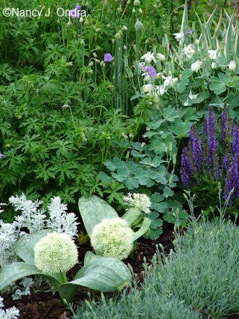
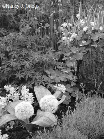
Here’s another vignette that’s pretty quiet color-wise but with some dramatic tonal differences, mostly thanks to the white blooms of Allium karataviense ‘Ivory Queen’ and fan columbine (Aquilegia flabellata var. pumila f. alba).
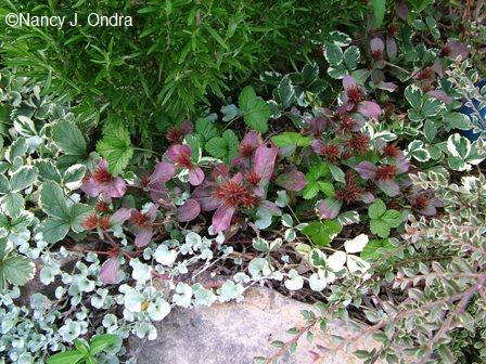
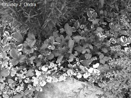
This exercise reminded me how useful silver leaves and variegated foliage can be in creating interesting combinations – not just for the colors they contribute (which is what I’ve always concentrated on), but also for the tonal differences (which I hadn’t thought about before). In the image below, the leaf textures are all pretty similar, so I would have attributed the interest to the variety of reds and greens. In grayscale, though, it’s more obvious that the white variegation of the strawberry (Fragaria x ananassa ‘Variegata’) and the near-white of the silver ponyfoot (Dichondra ‘Silver Falls’) also contribute to the scene.
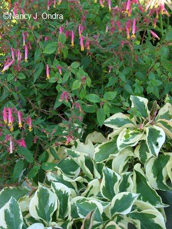
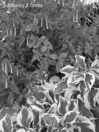
And wow, look how boldly variegated leaves really pop from a tonal-contrast perspective. The combo below was pretty in the garden, but in grayscale, the pink flowers of the Cuphea glauca practically disappear while the leaves of ‘Raspberry Ice’ bougainvillea grab your attention.
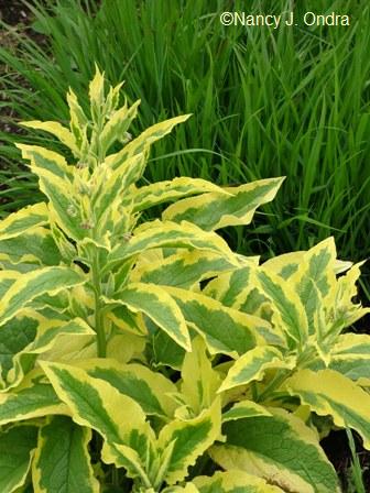
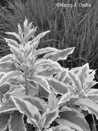
And here’s one of my favorites, ‘Axminster Gold’ Russian comfrey (Symphytum x uplandicum), looking equally smashing in both color and grayscale.
Bright yellow foliage, too, can be handy for creating tonal as well as color contrasts, without being as “in your face” as white. Below is Sunshine Blue caryopteris (‘Jason’) with ‘Plum Pudding’ heuchera, looking very cheerful in color and almost as good in grayscale.
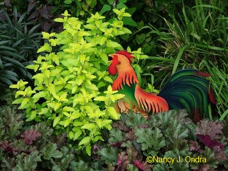
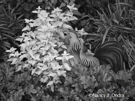
And look how the bright yellow leaves of golden elderberry (Sambucus nigra ‘Aurea’) remain distinct even when we remove the hues from this scene.
Admittedly, this is all kind of esoteric, because we mostly see our gardens in color, not in shades of gray. But there are two situations where tonal differences can be important to consider: in evening gardens and in shady sites. As Lawson explains, tonal differences “are perceived by the eye in separate light-sensitive cells called the rods, that only detect differences in light and dark. In dim light the rods function better than the color-sensitive cells, the cones. This is why you can still distinguish between light and dark in the failing light of dusk, even when you can no longer tell the difference between colors.”
I don’t have much shade in my garden, so I couldn’t find many images to illustrate this point. In this one, notice how the white Lenten rose (Helleborus x hybridus) flowers, the white-striped leaves of the ‘Kwanso Variegated’ daylily (Hemerocallis fulva), and, especially, the silver foliage of ‘Looking Glass’ Siberian bugloss (Brunnera macrophylla) stand out when the hues aren’t evident.
Want to play around with this using some of your own photos? I found two ways to turn color images into grayscale. The easiest was to open them in Photoshop Elements, then click on Image, then Mode, then Grayscale. A more basic way is to open them in Microsoft Word using Insert/Photo, then going to Picture Tools, then Recolor, then Picture Modes. There you can convert to grayscale or even true black and white. I then copy the image to MS Paint and save it from there. I couldn’t find a way to get grayscale directly in Paint; if you open an image there and go to Image, then Attributes, then Black and White, it literally changes it to black and white, not grayscale.
You may find easier ways with whatever photo-editing software you have. Will going through all this make you a better designer? Maybe not. But there are far worse ways to spend a winter afternoon than playing with pretty pictures, and you too may learn something along the way.

