The results for July’s Picture This contest are in. Our judge, Rich Pomerantz, has made his picks.
Drumroll, please!!
“I was very impressed by the quality of the entries this month. A few taught me new ways of seeing things through the eyes and lenses of others. I looked at all of the entries in the gallery, first noting the impact each image had on me, creating a group of selects. After my first pass I reviewed them all again to see if my initial impressions were still valid after looking at the group as a whole. This is an important step, as many photographs reveal their strength only upon revisiting them, so after a few passes I had my list of contenders.
Next I studied each of the selects to see if they held up under scrutiny. After the initial impact my concern turns to fundamentals like attention to lighting and composition. However if the image continues to resonate with me emotionally I am willing to overlook certain flaws; this is after all, what great artists do when they break the rules. I will say also that my top selections were very close in my ranking; in fact they kept switching places until my final edit of this post!
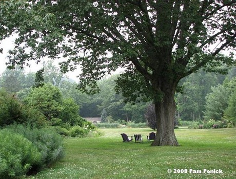
The photo from Digging was one of those that I initially passed by quickly. It just did not have much impact due to the general monochromatic green and the distance between the viewer and the chairs, but upon second look I realized that it was an effective image of the serene, relaxing landscape in softening summer light at Chanticleer, with its primary flaw being that it is far to the chairs which are simply too small to have the desired effect. I just am not a fan of lots of lawn in an image without a reason for it.
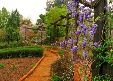
This wisteria arbor image by Sequoia Gardens uses one of my favorite techniques, focusing on a strong element in the foreground to catch the eye and then using a leading line to pull the view through the frame. The bare patch predominant on the left side of the frame hurts the image, but overall it is a good effort at showing the design sense and planting ideas of this garden.
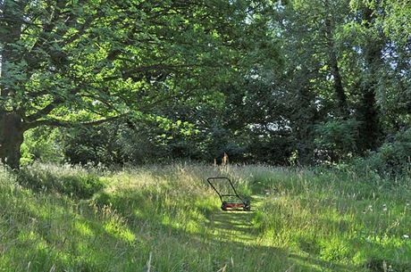
Robur d’Amour’s photo caught me up short at first. I thought “here’s some wise guy telling me his intent is to quit mowing in the middle to go inside for a drink”. On my second look I realized how smart this picture is. First, the lighting is gorgeous, absolutely perfect in fact. Compositionally there is nothing extraneous or unnecessary in the image at all, nothing out of place. It’s a simple yet perfect composition. And the push-rotary mower left in the path makes a strong statement that is congruous with the wildflower-meadow-as-garden, that it is intentional, which is one of the primary reasons for making a garden, after all.
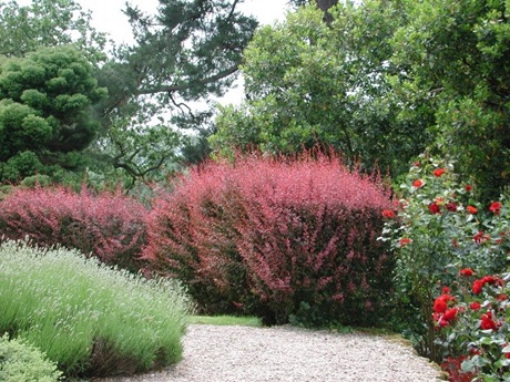
The neatness and forethought that went into the garden photographed by French Gardening is evident in her image. I only wish she had entered the other image she talked about on her site; it was a much stronger and more beautiful composition!
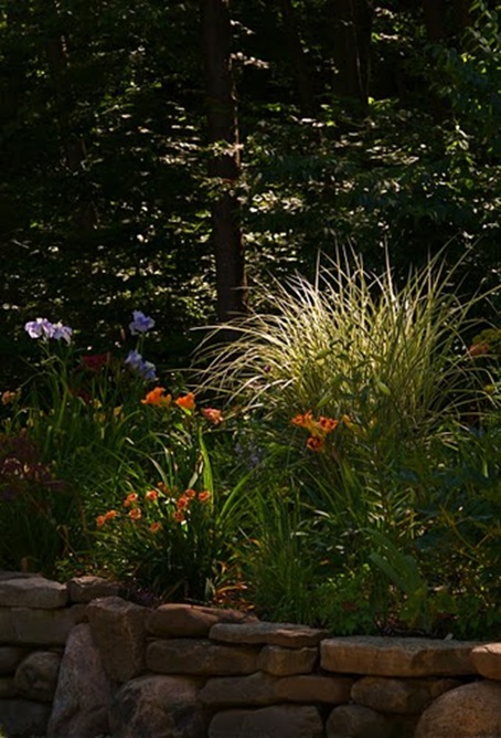
The first honorable mention goes to Mr. McGregor’s Daughter. The beautiful, moody lighting of the miscanthus is just right, and also illustrates one of the primary reasons gardeners plant tall grasses: to catch the low light of early morning and late afternoon.
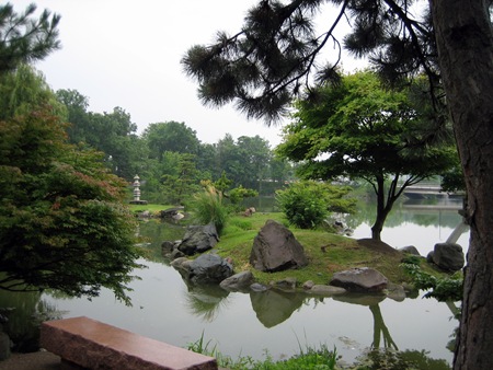
The next honorable mention is for Heather’s Garden’s entry, a lovely, quiet view of a Japanese garden through a foreground pine tree over an inviting bench. Even the white sky (usually a deadly sin for me) is nicely used as negative space to silhouette some of the branches. It’s a well balanced composition, and uses the reflections in the water well. The road in the background started to bother me though, keeping it from an award, but just barely.
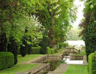
The Silver Medal this month goes to Qui Mal y Pense’s perfectly composed image of a Wiltshire formal garden. Utilizing the lines and bones of the garden, the photographer framed them within the softening new foliage in the central foreground and top, and the receding water towards the back. The formal intent of this garden is unmistakable, not a leaf is out of place, all is in focus due to a small aperture (appropriate for depicting a large formal landscape) and by using the angle to frame the image together with the placement of the lighter foliage the photographer leads the viewer’s eye into and around the entire frame effortlessly.
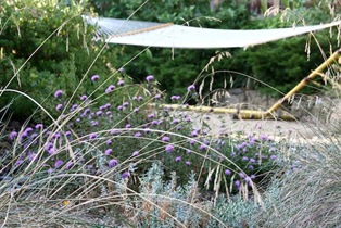
My pick for the Gold Medal this month is by Town Mouse of Town Mouse and Country Mouse: an intriguing and lyrical photo through a foreground of festuca and punctuated by whimsical purple coyote mint blooms to an inviting hammock nestled in a corner of the garden. The gardener’s intent appears to be to invite the visitor and the viewer into a world of whimsy and fantasy, appropriately thrown just a little bit out of focus with the correct choice of aperture setting, which is emphasized by the sharply focused curves of the grass and the flowers in the front. Well done!”
A big thank you to our judge this month, Rich Pomerantz for being so generous with his time and expertise. To all of you who participated, thank you. You submitted some first rate photos. And for those of you who are sitting on the sidelines and really want to participate but are a bit hesitant and just need a little push….well, here’s the push. Give it a try next month!
To see a gallery of all the photo entries for this month, click here. To check out all past Picture This contests, click here.

