Winners for Picture This Contest – October 2011

– Posted in: Garden Photography

Why oh why do we put our dear readers through this ?!  It is hard enough to judge the wonderful entries but is seems like agony to many of you who enter.  I read all your posts and more than one seem to wonder about winning and the judges’ criteria.
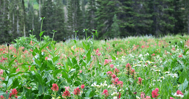
from Grandmother's Eden

How can This Grandmother’s Garden fantastic photo not be a winner ?  She clearly understands the contest theme “Fill the Frame” – the photo is carefully cropped, using the entire canvas to achieve a nice balance of meadow and woods.  The focal point is nicely off center and I really get a sense of a vibrant, verdant mountain meadow.  I want to be there.

So then, why is this not a winner?  I think when you see the others you will realize the competition is very stiff and if you want to get the real inside story go to each of the bloggers’s original post where I have posted constructive criticism.  There are 14 entries I have singled out for direct feedback on their blog, and will do nothing but lavish praise on them here.

For instance, Macgardens beautifully composed flower close up:
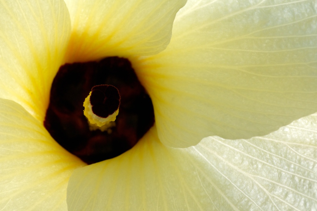
macgardens entry

This macro view completely fills the frame with the flower petals and the off-center pistil.  There is no wasted space.

Another macro photo, this one a spider in it’s web was sent in by Tropical Nature Photos:


Again, notice how the focal point is off center and the entire frame is filled with the story of this spider’s web.  Also note how the lines of the web lead the eye to the spider.  Great use of leading lines.

And as long as I am showing macros views, let’s look at this Epiphyllum oxypetalum from Queen’s Garden.

It is hard to use two flowers in one full frame but Janet worked these two until she found a clever angle that allows the stems and petals to intertwine in a sensuous embrace, where all parts of the photo contribute to one story.

One of the best ways to fill a frame is to find a scene with great texture. Use as much of the texture as possible until you have a tapestry bounded by the edge of your camera frame.  Outside Clyde did this with a fine view of three trees and leaves:

The frame barely contains this autumn texture and I love the careful composition that keeps the trees strong and parallel with just the right amount of leaves, like brushstrokes filling the frame.

Sometimes you can fill the frame with mood and atmosphere as Garden Walk Garden Talk has done with this wonderful photo of asters at sunset.

The frame becomes a vessel to hold the light while the flowers bask in the warmth.

I also get a great sense of mood from Malinda’s entry from The Potager Page.

The warm colors of the fall foliage in the distance make this finely composed poppy photograph something special.  The flower, with just the right accompanying leaves and buds, fills the frame in the foreground and the color fills the background.

Let’s look at some landscape photos to see some other ways our Gardening Gone Wild photographers fill the frame.  A landscape scene can be difficult to photograph.  Often they are complex with many elements contributing to the feeling we have while admiring them.  It is important to frame only what contributes to the story you tell, and frame out what is peripheral.

Sometimes that means cropping the photo in our mind knowing the camera will take the photo in its own pre-defined frame.  This picture from Gardening with Greggo, a strong horizontal, was cropped so that we see only those flowers that contribute to filling the frame.

I love the way it is cropped at the bottom as the Rudbeckias bleed off.  We know there are more but the composition wants us to see the intermingling with the others.

I have great respect for landscape photos of gardens that seem simple yet tell a big story such as this photo of the Bloedel Preserve submitted by Jean at Dig, Grow, Compost:

I absolutely love the stream coming in, using only 3/4 of the bottom of the frame, while the dark foliage and rocks edge the lower right side.  We see just enough of the trees to get a sense of their scale and how they define the woodland and the sheltered stream from the house beyond.

We now come to the Honorable Mentions and Silver and Gold awards.  All of the above deserve honorable mentions too and indeed there are a good number of great photos that I did not even call out in this post.  The ones above served to illustrate some of the lessons I want to emphasize but I am mightily impressed by all the submissions – you guys thoughtfully considered the theme and I am so pleased you rose to the challenge.

There are three honorable mentions.  This wonderfully moody dusk shot sent in by Donna at  Green Apples is suffused with warm light.  Every part of the frame has been used to reinforce the story of these strong solid trees receiving the meadow and the light.

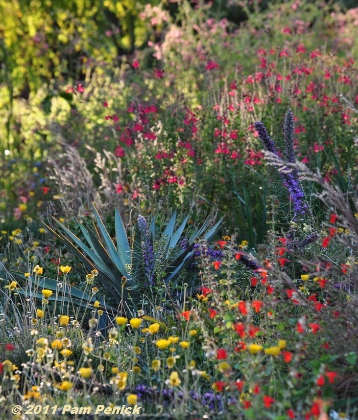
Pam at Digging once again gets called out for some GGW recognition with a carefully composed yet marvelously complex photo.

This photo has been carefully cropped from the original so that the yucca sits squarely in the sweet spot.  The focus is razor sharp at that point and all the other colors and shapes swirl around.  Yet the yucca is the solid anchor nestled among the transient flowers.

Another great shot that was carefully cropped to fill the frame came in from Olivia Garden.

I just love these gray mounds and red flowers and the feeling that the edges of the frame provide just the view that Olivia wanted us to see.  Since I can not post a comment on her blog I will add a bit of constructive criticism here.  If you cropped a bit in from the right, to get rid of that top dark “hole” I think you will further emphasize those  strong lines of red flowing to a powerful focal point.

Our Silver Medal Award goes to Experiments With Plants for this deciduous tree filling the frame with its branch pattern.

picture_this_silver[1]

Classic subject that I have tried many times myself, seldom so well.   It’s a great choice of tree as this particular one has a branch pattern that offers dynamism and anthropomorphic character.  I really like the partner tree filling the frame in the lower right and the fact the composition allowed for just a wee bit of space in the bottom right edge.  That trick really allows the right side of the tree to become an arch and leading line.

The Gold Medal Award goes to Hoover Boo at Piece of Eden

picture_this_gold[1]

The nearly square, perfectly cropped photo is filled at every corner with details that tell a story of a garden.  That, you must know, is my bias in all judging – to see a garden in a landscape view, a garden photograph that tells me its story in every inch.

The tree is wonderfully positioned, its branches reaching out to the sides as well as the top; the pair of dark, nearly silhouetted shapes in the upper right not only fill that corner but offer the dark contrast to the strong light we know exists outside this garden.  I see lushness in the lower plants and know that must be the story, in what must be an arid climate.  Everything in the frame contributes.

Thank you all once again for your thoughtful and beautiful submissions.  I hope you will gain a bit more insight from comments I have given on the 14 posts mentioned.  What a great group you are.


Saxon Holt
Saxon Holt is the owner of PhotoBotanic.com, a garden picture resource for photographs, on-line workshops, and garden photography stories. An award winning photojournalist and Fellow of The Garden Writers Association with more than 25 garden books, he lives and gardens in Northern California. PhotoBotanic - Garden Photography online at www.photobotanic.com. https://photobotanic.com
Saxon Holt

Latest posts by Saxon Holt (see all)

23 comments… add one

Leave a Comment

Tatyana October 31, 2011, 12:07 pm

Congratulations to all the participants and the winners, and Thank you to the Judge for the excellent lesson!

Carolyn October 31, 2011, 1:10 pm

Thank you for your kind remarks… I feel it an honor to be mentioned, and I forgive you for the error in my blog name. Win or lose, I actually enjoyed participating and learned a great deal.

Error ?! I don’t see an error – now. So sorry about that and it is corrected. At least it was linked to the right blog… Thanks Carolyn. – Saxon

John October 31, 2011, 1:45 pm

Certainly a lot of great pictures here. I’m pleased to have gotten such excellent feedback from the judge.

Lona October 31, 2011, 2:15 pm

It was a fun contest. Congrats to all of the winners!

Janet, The Queen of Seaford October 31, 2011, 2:28 pm

Congrats to all the winner, what a fun exercise.

Jean October 31, 2011, 3:07 pm

Ah, I really get it now. Thanks so much for your thoughtful comments on all of them – it really helps me “see.” And a big congrats to the winners. Oh heck, everyone else too – there were so many good ones.

Pam/Digging October 31, 2011, 5:37 pm

Thanks for the honorable mention, Saxon, and the constructive criticism too — very helpful! And a big congrats to the winners! This was a fun contest to take part in.

Hoover Boo October 31, 2011, 5:54 pm

Wow, this is a big surprise! Thanks!

I agree, more contrast & color would help. It was tough to shoot that scene. There’s irrigation pipes, sprinkler heads, a telephone pole and electrical wires all there as well (look carefully) and I was trying to shoot the tree with the light behind it and enough light on the foreground while at the same time hiding the pole, pipes, wires, and sprinklers with the right angle of foreground foliage. All while the light was rapidly dying.

Again, big surprise, and many, many thanks, and thanks even more for the helpful comments and explanations. I learned a lot. Hopefully it will show up in my pictures eventually. Takes a lot of effort to permeate this mental tundra.

Donna October 31, 2011, 6:22 pm

Thank you Saxon for all the time you gave to this contest. I really appreciate the feedback and learning is the reason I enter. It was a wonderful exercise and you did a great job presenting it. Congrats to Hoover Boo and Experiments With Plants on their wins.

ks October 31, 2011, 9:33 pm

Yay Hoover ! A California blogger wins big. We knew you when…

Christopher C NC October 31, 2011, 10:02 pm

Thanks for the tips Saxon. Now I know your bias as a judge. That’s helpful. Congrats to all.

Well I am a garden photographer after all and know the difficulty of taking the wider view of a constructed landscape. However I am a landscape photographer at heart and like many of our contestants, find tremendous satisfaction in taking my camera out into nature that inspires us all.

I loved seeing all the nature shots that were submitted, they will inspire my own work: fall foliage tapestries such as yours, meadows, and woodlands were all great fun to see. Many were called out for their exceptional use of the entire frame and I hope knowing the judges bias should not prevent submitting great photos that can contribute to our group.

I will say I did announce my bias when I started the contest:
“I am particularly partial to wide views of gardens that are well enough composed to fill and burst out of their frame”.

I look forward to judging future contests. – Saxon

Gillian October 31, 2011, 10:31 pm

Congratulations to all the winners. thank you too Saxon for all the detailed criticism you give – it really helps improve what we try to do.

Debbie November 1, 2011, 6:14 am

wow – amazing pictures. Constructive comments will help for future photos.

The Sage Butterfly November 1, 2011, 8:31 am

Thanks for all the commentary. It really helps me learn more about creating good photographs. Congratulations to the winners! These are beautifully framed photos.

One November 1, 2011, 8:36 am

Saxon, Thank you for the feedback. It is very much appreciated. Congratulations to all who participated. I am sure everyone learnt something from you.

Melody November 1, 2011, 10:52 am

Congratulations to all! And thanks again for letting me “play” 🙂

b-a-g November 1, 2011, 2:04 pm

Saxon – Thanks for the award and for giving so much feedback to us participants. Glad you noticed the anthropological form of the tree – it reminds me of the statue of liberty. I have to admit that the space on the right wasn’t intentional but I’ll remember your tip in future.

Hey – take credit for those “unintentional” parts of the photos too. Those unconscious elements are what makes a good photographer. – Saxon

ESP November 1, 2011, 10:00 pm

Congratulations winners!

Malinda November 2, 2011, 10:12 am

Saxon, Thank you for all the time you spent and the wonderful feedback, which I very much appreciated. Your photes are very inspiring to see as well as all the submissions.

Lynn November 2, 2011, 7:12 pm

Boy I missed this one. I either didn’t get the email or didn’t see it but I thought there wasn’t a contest for October. I assumed there wasn’t a judge to fill the spot. We know what happens when we assume!!! I added a new email so there shouldn’t be any problems. (I hadn’t gotten an email since Sept so I think something was wrong).
I would have loved to participate in Octobers contest. Oh well. November is here so I’m ready!!!
BTW: There were some really beautiful photos for Oct. Congratulations to all.

Lynn – Sorry you missed out. Have you subscribed to our RSS feed ? We do try to have a monthly contest so don’t wait so long to check us out ! While Fran had been doing an incredible job lining up our guest judges, I am always available. (Fran ? You didn’t see this, did you ?) – Saxon

Debra Lee Baldwin November 3, 2011, 2:51 pm

Great contest, tips and photos! Thanks, Saxon for putting so much time and thought into this. I’m grateful and learned a lot. As an aside, I used to shoot subjects off-center, positioning them in the sweet spot, but when I sent a batch to my publisher for my first book, the critique was that the reader would want to see more (too often, off-center meant partial). So now when I’m shooting, say, a container composition, I usually do a strait portrait shot as well as one that’s more artfully dynamic.

Thanks for the comments DL. You are correct that when a publisher wants to see pictures they often want the main subject centered to give their graphic artists room to crop. I think one must also recognize the nature of the “subject” that is being positioned in the photo. A container, or a choice plant subject is a clear focal point that when composed off center gives the editor little room to maneuver, whereas a garden scene with good depth of field may need to be of center just to make it interesting. – Saxon

Greggo November 4, 2011, 9:24 pm

Saxon, thanks for the great time and the honorable mention. I enjoyed your posts as well as your tips. Your tips and critiques where spot on. I look forward to having you back as a judge. Sorry I took so long to respond as I’ve been without technology for two weeks. Greg.

“without technology for two weeks” sounds like a vacation to me. Thanks for being part of the contest . – Saxon

Town Mouse November 6, 2011, 10:53 pm

Saxon, that was a great contest, and I learned so much from looking at the photos, trying my own composition, and reading your posts. Thanks very much!

Thanks Town. The whole purpose is to get you guys to trying things and learning. FWIW,I learn from the submissions. Fun for all. – Saxon

[shareaholic app=”recommendations” id=”13070491″]

0 Shares
Share
Tweet
Pin
Share