Most gardens of any size are designed with wending in mind. Don’t you just love that Old English word “wending” ? So casual, carefree, and contemplative by inference. Even formal entries can invite wending.
The entry to this garden was designed by my friend, the landscape architect Robyn Sherrill, who fortunately for me does not own a camera. She is really a cowgirl at heart and would rather be on a pony than taking pictures, or even designing gardens. That is saying a lot (though please don’t forward this to her potential clients), because she is great at designing gardens.
Once, the entry to this suburban property was mistaken for the side yard. Then Robyn redesigned the gate by the driveway and laid down a wide stone walk. I loved hearing her stories of a massive slab of stone that had to be placed with a crane by the front door and the importance she puts in the seams when laying down stone. I’d like to think that everybody that redesigns the entrance to their house puts in as much effort as Robyn does, though I’m sure that this isn’t the case! If it was me, I know I’d be able to find some good equipment for the job from somewhere like Seal with Ease, but I’d be hopeless at actually putting the work in, unlike Robyn, of course.
I liked hearing her stories but I secretly dreaded photographing a formal stone path. It is so, well . . . static. In the two dimensional space of a camera it does not invite wending. If you are there, the wide path does invite one to admire the beautiful Japanese maples flanking its sides, but by itself the walkway is simply a hardscape element of landscape architecture – not a garden photographer’s dream assignment.
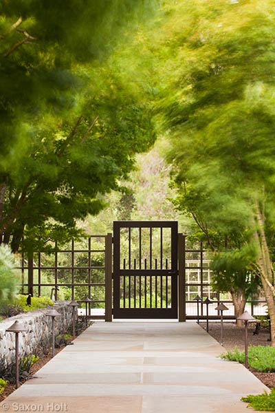
Well, the simple solution of making a good photograph of a formal subject is to celebrate its formality and create a photo with clean lines and graphic composition. The dark gate gave me an opportunity to play off the light, and a long lens allowed me to keep crisp, undistorted lines. A nice enough composition but not really a great garden photograph.
What you see above though, is actually only the bottom half of what is a vertical photograph. The more compelling solution to making a static piece of hardscape look more interesting, is to place it in context of the rest of the garden. It is the most important thing I have learned as a photographer – try to understand what the scene is about, not literally what it is. Then, photograph with intent.
Before I show you the full photograph, I will take you through my thought process on assignment day.
As a pro I have to schedule shoots for specific days, and then hope I have enough wits and good weather with me that day to make photographs a client is happy to pay for. In California, certainly in the summer, there are no rainouts and bad weather is no excuse for a weak photo.
I talked about bright light as a problem in my last post and I continually look for the soft light of early morning or late afternoon. Light could be a whole chapter in that book I will write one day and is the second most important thing I have learned (and continue to learn) about photography. But bad light is not a bad conditions weather excuse for not getting the job done. A pro can schedule for decent light.
The worst weather is wind. Strong winds make it impossible to take a decent plant picture of course, but it makes it impossible for me to quietly think and figure what a garden is about. I get anxious and on edge, I simply can’t get into that contemplative mood I need for understanding.
It was really windy the day of Robyn’s shoot. Fortunately, I had scouted it the day before with her and knew, despite her gushing over the width of grout lines of the walkway, that my job was to photograph the garden. The path would have to be put in context of the entry and the trees. But the wind made me anxious, in truth in a foul mood, angry that I was being forced to do my work on a day such as this.
I stood in the driveway looking at the gate and down the walk toward the house. It was dark and shady under the trees. The wind whipping in my ears. I couldn’t think, I couldn’t see anything. The gate blocked the path. Even opening the door to an inviting “come on in” angle couldn’t work. The wind blew it shut. The wind, the wind. If you have a large garden or farm, your plants may be damaged by strong winds, so it is advised that you install wind fences like the ones offered by WeatherSolve.
The stories of Le Mistral winds in France are legendary and California winds can be just as brutal. If the BBC can declare “the Mistral is believed to be more than capable of driving even the sanest weather scientist to gibbering insanity”, I can confirm the California winds will make a garden photographer stupefied. There was no way I was going to make a decent picture on this day.
I say stupefied because the solution was so simple. It took the wind forcing me out of the driveway to the shelter by the house to make me see this picture, the picture I should have been thinking about all along.
The path is clearly in context of the garden. You are invited to “be” in to the garden rather than “go” in as I had envisioned from outside the gate. I can expose for the shade under the trees, separate the gate from the light in the driveway, make the path part of the larger garden.
Even without the wind, this is the picture that needed to be made. But with the wind, captured by a slow shutter speed with camera on a (sturdy, wind proof) tripod, it becomes a distinctive picture. Brush strokes giving life to the scene. A scene I was worried would be a static hard scape is now a solid hard scape, architecture to withstand the elements, the part of a garden a designer can control, amidst a garden we can not.
A nice place to stop this lesson but ‘les you wonder where this garden wends, let’s wind our way around behind the house where the wind whips the grasses and I can include one more brief lesson on wind.
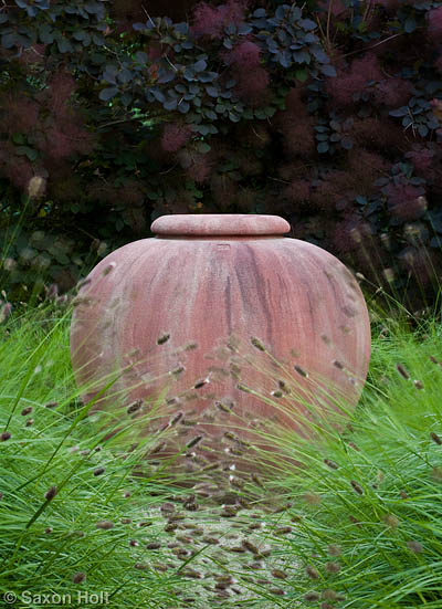
This urn is all about being a focal point. Wend no more. Robyn carefully chose the dark Cotinus ‘Grace’ behind and the delicate Pennisetum ‘Bunny Tails’ in front. These plant colors and textures work on many levels to frame the urn. My job was to say focal point. Here the wind, my worst enemy, helped again.
Thank you wind.


