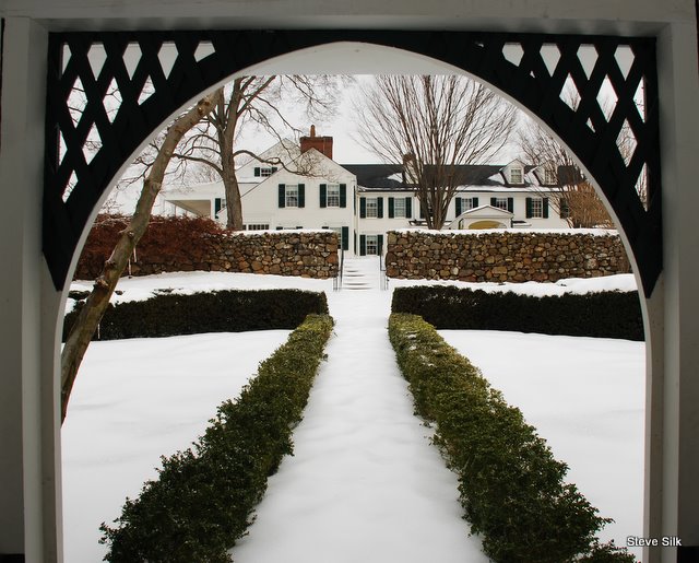
This is the first installment of Design Lines, a new GGW monthly column devoted to exploring the role of structure in garden design.

At the Sunken Garden, it’s all about the lines. I often stroll through grounds of the Hill–Stead, a manse turned museum not far from where I live. The main reason I head in that direction is to look in on its Sunken Garden, a gem designed, back in the day, by Beatrix Farrand. Depending on the season, I might gaze upon its carefully wrought color combinations, its fraternity of plants, and the welcoming refuge of its pavilion. But for me the real splendor of the Sunken Garden’s design lies in its geometry.
Even in the dead of winter, on the darkest days of December, the Sunken Garden is a thing of beauty. Why? Because of its structure, what some refer to as the bones of a garden. Bones are the architecture of the garden, the permanent structural elements that provide a framework for all the rest. Bones might be evergreens, they might be hedges, they might be built objects such as walkways, fences or arbors. No matter what day you look in on the garden you see its bones.

From the top step of the stairs descending to the Sunken Garden, I see a whole world of bones, knit together with a genius that ensures the whole is greater than the sum of its parts. First, there is the pavilion, a simple but alluring structure that extends the promise of sanctuary to the garden visitor. Pointing the way to this place of repose are the arrow-straight brick walkways lined with boxwood hedges. Surrounding the boxwoods and pavilion like a frame for a picture, are a hexagonal brick walk, enveloped in turn by an octagonal yew hedge. Those two elements frame the main garden beds, laid out, from a passing bird’s perspective, as a perfect octagon. Finally, in yet another layer, there are the enclosing walls that define the garden itself, long sweeping arms of stone that hug the garden in a protective embrace. The whole effect is one of classical formality, a mathematical triumph.
Yet, it’s more than that. A math-based garden design could easily be boring or predictable, but the Sunken Garden reminds me, somehow, of a Navaho rug. Those too are paeans to formalism, their perfect shapes interlocked in a seamless celebration of order. But the Navahoes believed only God was capable of perfection, and so to ensure their weaving would be worldly, they introduced mistakes into each piece they produced. In the same way, the Sunken Garden celebrates order, but with a hint of mischief. The enclosing stone walls look symmetrical at a glance, but they are not. And there’s an endearingly quirky entrance to the garden here and there, punctuating the orderly formality with a dash of whimsy. I especially like the almost randomly placed gothically spooky stone archway that leads into the garden through the wall’s eastern side.
One of the dangers of designing a geometric jewel box of a garden sunken into the Earth is that it might feel suffocating or claustrophobic. But the Sunken Garden feels open thanks to its expansive sight lines, which escort the eye out to the surrounding landscapes. Think of the straight shot from the top step: the eye races along the boxwood-lined brick path on its way to the pavilion, travels though, and then onward, past Theodate Pope’s sundial, through the open gate, and out into the freedom of the open pastures beyond. Or, maybe you’re sitting in the pavilion, the garden’s inner sanctum. In one direction lie the fields, in another the arched entry provides a handsome frame for a different destination– the family home. There’s always some place to go, so you never feel locked in.
Like I said, it’s all about the bones, which here are knit together just so, to create a sanctuary-centered, welcoming enclosure surrounded by geometric patterns to delight the eye and engage the mind. All that, 12 months a year. Such is the beauty of bones, and of the Hill-Stead’s Sunken Garden.
