The entries are in and we have a winner !

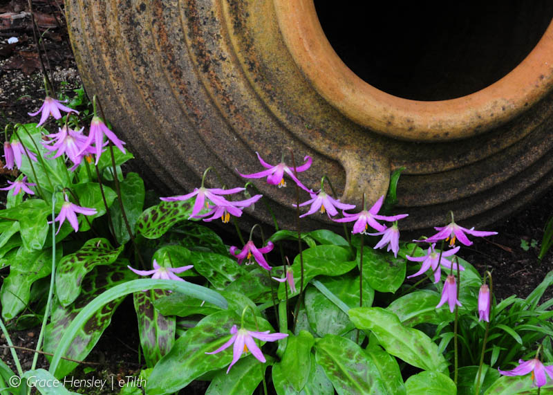
Gardening Gone Wild – Picture This Contest 1st Prize from Grace at eTilth
 Congratulations to Grace at eTilth for the photo of Erythroniums tucked by this urn in the Dunn Garden in Seattle.
As a new feature for our contest, have put all the entries into a flickr Album and offered critiques of each, showing my before and after suggestions for each photo.
As is so often the case during my workshop critiques, the biggest suggestion is to make a tighter composition with less wasted space – a full, well constructed composition is most important to getting a good photo and a prize.
I really liked how the urn filled out the upper corner of the winning image from Grace’s image how the urn gave a good sense of scale to the fawn lilies.
The Silver Award winner went to Laura at Gravy Lessons for this great capture of a dandelion seed “arrow”.
 Great eye for detail Laura ! Filling the frame with the design makes a full composition. In the critique image, found in the contestant’s gallery, I straighten the arrow and added some extra contrast to emphasize the design.
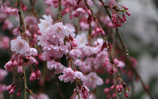
The photo that gave me the best sense of spring came from Jude, who entered the contest without a blog to visit. But the contest is about spring after all, and these flowering cherry trees from her visit to Japan are the quintessential spring photo. Judges really like it when a photo is right on target for the contest, so she gets an Editor’s Choice, Honorable Mention.
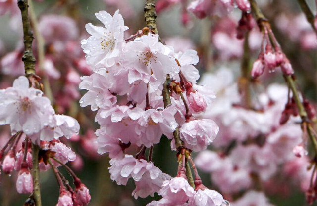
 I am sure Jude won’t mind me showing my critique here for others to learn what I look for. Like the other winners, this photo gives a special sense of the photographer’s eye. I feel I am seeing something unique.
I would have cropped tighter to emphasize the lines of the branches and I would brighten the scene. Even though it is clearly an overcast day with raindrops, I think I would open up the image to be more cheery and springlike.
As in all the suggestions I make in the contestant’s gallery, these are my own suggestions and there is really no right or wrong in artistic interpretation. I do hope you all will check out the gallery and my critique. It is what I do in my own workshops and students seem to really like learning from the work of others.
And it is fun to see the blog posts that provided the images. I hope you will visit these blogs to see more spring gardens, now that it is almost summer.
Alexandra at The middle size garden
Jenn at Victory or Death! . . . in the Garden
Lynn at Mama Zukes Photo Adventures
Jan at Form and Foliage
Kate at K Walsh Photography
For any contestant who reviews my critique and wants a free copy of my iBook, Composition 101, let me know here in a comment. My iBooks are single article excerpts from the eBooks, a quick lesson and Compoistion is Lesson 1.
Thank you all ! Now be thinking summer pictures for the next contest.


