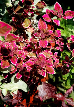
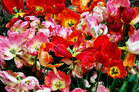
Red is the color in the garden that most titillates my senses. It’s a color dripping with passion, power and boldness. When used with great abandon as in the red garden at Hidcote or what was once the red border at the now defunct Hadspen Garden (but that can still be viewed in Nori and Sandra Pope’s book Color By Design), red rules!
 The sight of a crisp, blood red jolts our senses and makes us feel more alive. The color red says ‘Notice me. I’m a diva and a force with which to be reckoned.’ After all, why does someone choose to buy a red car or a red cocktail dress? They are giving off signals that unabashedly say: ‘I’m one sexy siren. Touch me and you’ll sizzle!!’ In order to pull off a red garden successfully, you need to be fearless! When a red garden works, there is nothing quite as magical and powerful.
Because I don’t consider myself a precise colorist, I have found two ways of using red successfully in my garden. First, as with any color, the range of the red family begins with the deepest of burgundies to vermillion /bluish red transitioning to orangish/reds morphing into what is almost a pinkish/red. The subject of ‘how to use red’ in the garden is such a mammoth one that I’ve decided to break it down into sections. In Part 1 of ‘Shouting Out With Red In The Garden’, I have chosen only photos of tulips to show how the use of red has the ability to significantly change the feel of a composition. So, let’s start simply with a few red tulips, ready to bloom in dappled shade with some blue violet wild violets nestling at their feet. Simple and sweet. Even that snippet of a calm red pleases the eye with promises of what’s to come.
This next photo is of another grouping of tulips surrounded by green foliage. On the color wheel, red is the direct opposite of green: when grouped together they resonate. Because of the orangish/red color of these tulips along with the sunlight streaming its way throughout these plants, one is embraced by the warmth the tulips convey.
The two photos below are groupings of tulips from my cutting garden. These are good examples of how red works when juxtapositioned with other colors. In the first photo, the red tulips are complementing their softer red and pink and counterparts: whereas in the second photo, we get to see how these red tulips stand up when coupled with the orange/apricot family (which I actually love). Placing colors together in a garden is very similar to composing music. The note ‘C’ has a unique sound (for anyone who has studied or knows some music) but when you use it in context with a slew of different notes, it often takes on an entirely different tone and sometimes it becomes difficult to even recognize that it is a ‘C’ (I hope that makes sense for those of you who are not musicians).

