Most of us see in three dimensions but the camera sees in two. In this chapter, as we learn how to Think Like a Camera, we will need to understand how the camera flattens shapes and how to use those spaces we see in three dimensions to become building blocks of our compositions in two dimensions.
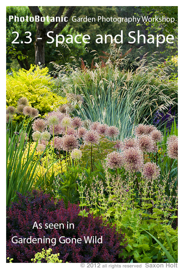
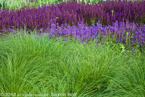
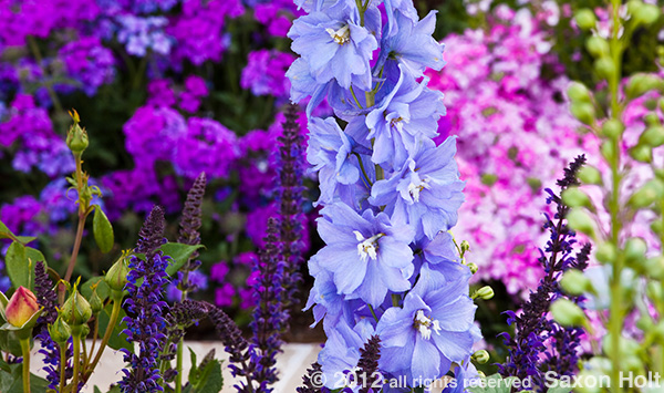
In the opening cover shot, note how all the plant shapes are stacked up and arranged in the composition to overlap and fill the frame. When a photo is filled with such shapes and textures I call them tapestries and many of my favorite photos use this technique.
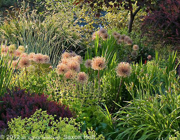
Framing the spaces of a garden into two dimensions will create blocks of shapes, and when those shapes are consciously used to compose the full frame, it becomes a tapestry.
For some reason I have always loved medieval tapestries, and I will go out of my way to visit museums that feature them. The best ones tell intricate stories of great deeds and fables from ancient times. Woven with no sense of depth perception, tapestries are crammed with shapes and the spaces around each shape always seem balanced.
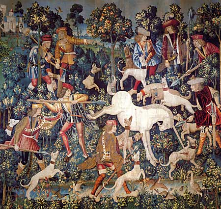
Be aware of how completely flat and two dimensional a tapestry – or a photograph, will present itself.
The concept we want to be aware of when we are taking pictures is to think about how the blocks of shapes that will be rendered. To be a pleasing composition those shapes need to fit together like a jigsaw puzzle.
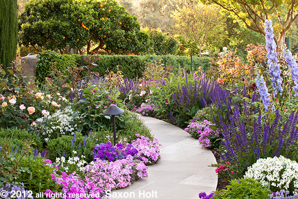
Even a typical garden scene needs be considered in the shapes you put together.
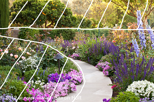
The shapes are nicely balanced. Note how the main shape, with path as a leading line, combines with either of the other shapes to create a nice 1/3 and 2/3 balance.
The three dimensional scene becomes two. The spaces each of those shapes will occupy within your frame equals the composition. We have already worked with focal points and forced perspective but these now we need to work within the blocking of the composition.
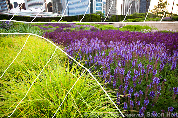
Another very useful tool for using blocks of shapes to create a composition is color. Blocks of color are graphic ways to allocate space.
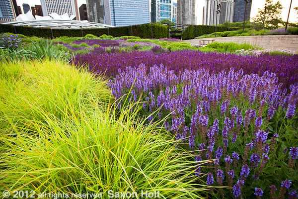
Note the three distinctive parts of this photo: the block of color, the buildings, and the texture of the prairie meadow. Lurie Garden – Chicago
Note the shapes of these spaces are nearly identical to the earlier photo with the path; and again we are taking a three dimensional scene and finding some fundamental shapes so that it translates into the two dimensions of a photograph.
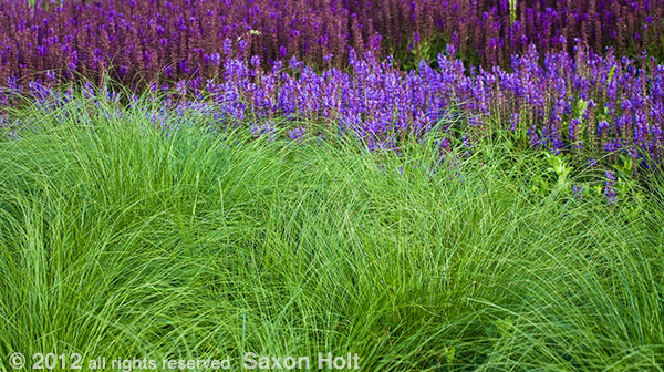
Before I go back to the more complex tapestries, let’s look at another example of color blocking with shapes.
This photo of the native bunchgrass, Prairie Dropseed (Sporobolus heterolepis) is its own shape and dominates 2/3 of the composition. I found a vantage point where I could find two other shapes to compliment the remaining 1/3 space.
Actually, in my original frame I confused myself trying to include a fourth shape at the top. I think this was a mistake and cropped it in post production.
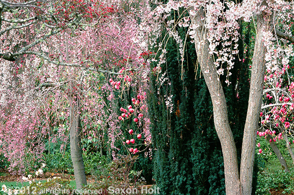
OK, I am going to treat myself to one of my current favorite photos, a tapestry of shapes.
All the shapes contribute to this tapestry effect, including the block of off white at the bottom left – a balancing shape to the dark area in the upper right.
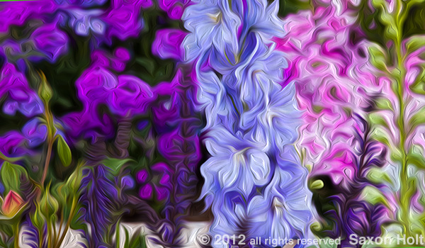
And now with the artistic potential. (More on artistic treatments in Chapter 4 – The Camera and the Computer)
Another example of this painting technique is on my Mental Seeds blog.
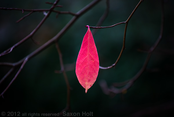
A really important concept about shapes in a composition involves negative space. Negative space is a block within a composition that is not part of your story. It carries no real content but is a balancing shape, and is usually bounded by the edge of the frame.
It can be a single block of muted color and texture, like the sunlit garden in the out of focus distance behind these Iris.
Or negative space can be a a group of dark spaces with strong graphic appeal in this macro detail of frosty Berberis leaves.
Conscious framing will often create unused spaces that the artful photographer will use to balance the composition. The five background shapes around these frosty leaves were carefully created by using the edges of the frame.
From my November 2009 Gardening Gone Wild post Composing With Color comes an example where negative space is fundamental to the composition:
Space and shape. This is a concept that is not easily taught. We must each develop our own sense of composition and balance, our own style. Carefully and with firm intention fill your frames with shapes and spaces.
As the book continues we will dissect even more examples. The most complex examples, the tapestries, tend to be the most artistically rewarding. Lots of interlocking shapes.
Stay tuned…

