Both Debra Lee and I have shared stories of how cover photos are chosen for our books. (See my post about the cover of Homegrown Herbs or Debra Lee’s post on Succulent Container Gardens) Magazines are much different. They have multiple stories to tell, virtually putting the table of contents up front for quick reference.
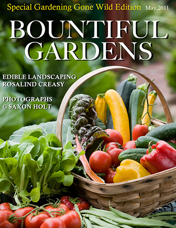
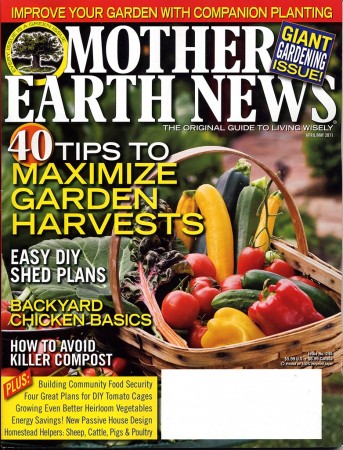
This will be a little story on the cover of the new issue of Mother Earth News and a photo I shot almost 2 years ago. The fanciful cover of “Bountiful Gardens” above, is an outtake, using the photo I thought was the strongest. Note how the focal area is off center and allows for “sell lines” – the text on a magazine cover that sells the stories within.
Every magazine and every art director has a different set of challenges with a cover. Some magazines depend heavily on newsstand sales (though the definition of newsstand is quickly changing), whereas those with a largely subscriber base don’t need to convince the reader about the value of the content within. Mother Earth News has lots of sell lines and the ideal photo must be carefully composed.
This photo shoot took place in the front yard of Rosalind Creasy’s delightful edible landscape. Her book, Edible Landscaping has just come out but had been years in the planning; and the photo shoot itself was planned in anticipation of current interest and publicity for the book.
We set up in her front yard and assembled the props – all of which came from her garden. Ros is a master at these sort of harvest basket shoots, having perfected them with photographer David Cavagnaro many years ago. She has an assortment of baskets, trugs, and assorted charming garden accoutrements for just these occasions.
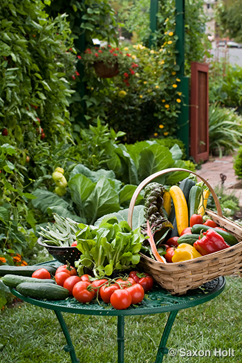
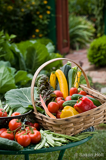
For this cover shoot we knew the magazine needed lots of room for the sell lines and the only window to the photo would be in the lower right of the final crop. This preliminary picture, while technically having the emphasis of the photo in the lower right, has much too much of the background in focus, which leads to confusion when type is positioned on it. And the veggies are placed awkwardly, with little symmetry.
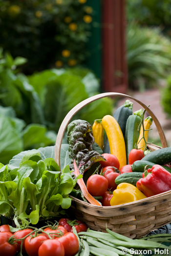
A slight change in camera angle (note how the squashes at the top are now better isolated against the path beyond), a longer lens, and moving the beans to the fore gives us the final composition, the best stand alone photo, and the one in my mock-up cover Bountiful Gardens.
Looks sorta naked. But this is even too tight for the magazine. Their sell lines wrap all around the cover, even under the photo. So I loosened up:
Now the basket is smaller in the photo, but won’t get lost when the type is added. It appears in just the right spot:
One might be tempted to say it is too crowded with type, but their readers like to know the April/May issue is full and even over brimming with useful stories. The white area is for mail, fortunately that box is not on the newsstand version, but never-the-less an area that must be anticipated by the art director.
I learned long ago that sales and marketing folks decide the covers of publications, for books and magazines. It’s their job, with more complex considerations than photographers or writers. One learns to trust the collaborative process, and be happy to work on interesting projects.
And I got to take home a lot of those props – the edible ones anyway.

