 Since I am the judge this month for our Picture This contest, I am taking the opportunity to expand on my theme – Fill the Frame. Link to contest entry rules and previous post. Whether or not you intend to contribute a photo to the contest or just want to take stronger photos you will want to be mindful of filling your frame as fundamental to your composition.
Think of your photo as an artist thinks of a canvas, every part of it is meaningful and contributes to the overall story. Whether you frame up your photo in the camera or crop it later, think of the four edges as the edge of your canvas and find a composition to hold your viewer’s eye on your subject.
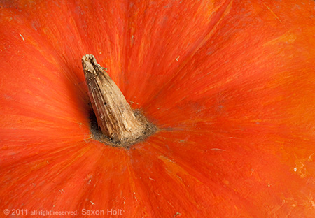
The gloriously scarlet orange pumpkin in the opening photo is all about color, there is no reason to show any edges. Note I have composed it so that the stem is off center and I can take advantage of the striations that are part of this heirloom Cinderella pumpkin, ‘Rouge vif D’Etampes’.
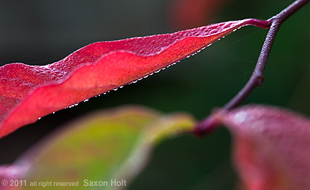
Macro photography can be difficult to fill the frame effectively because too often photographers will put their subject dead center due to the short depth of field and limited sharpness. A centered composition can certainly work, but be aware of the potentially boring space around the edges of any macro image. This tupelo leaf, in my original contest posting, is a good example of using negative space effectively when filling the frame.
In most of my workshops I concentrate on landscape photography and “seeing” the garden. Filling the frame of a landscape picture requires the photographer to think clearly about the story you are seeing and distilling it down to just the elements that contribute to that story.
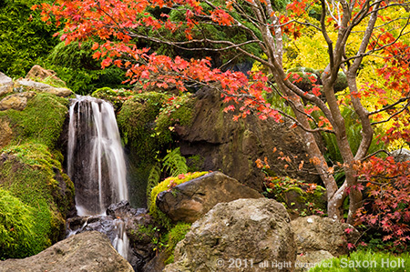
In this picture of a waterfall in autumn at the Japanese Tea Garden in San Francisco’s Golden Gate Park, I have cropped the photo and filled the frame with only those elements that tell the story. We don’t need to see more of the tree to know it is autumn, but any less will not fill the frame with the wonderful branch structure, and would cut out some of the yellow foliage of a distant Ginkgo tree.
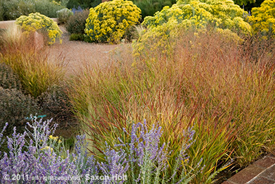
Sometimes when you are working to find the best composition to fill your frame you will need to walk around the scene; frame up different angles in the camera. In this scene in the gardens of Museum Hill in Santa Fe New Mexico, I was struck by the fall color in the grasses and perennials of this wonderful drought tolerant garden.
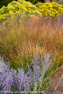
This first picture is typical of how I work. I try to get a few quick pictures before the light changes while I process what I am seeing. I was really struck by the color of the grass (Panicum virgatum) and how it was sandwiched between the late summer flowering perennials. As I became more confident in what I wanted to say about this, I realized I could best tell the story and fill the frame as a vertical:
The vertical composition distills what I was seeing – and what I want the photo to say about fall color and grasses in a New Mexico garden. I wanted the frame to be loose enough to still say ‘garden’, so I needed to see both a bit of the pathway at the bottom and a hint of the garden beyond at the top of the frame, but still emphasize the three main colors I saw in the plant material. The first, horizontal photo, now seems too loose and did not use the frame as effectively to tell the story.
Let’s look at one more example of getting to the core of a garden scene, finding the photo, and filling it with the story.
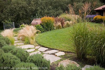
I love the way this garden juxtaposes a small lush lawn near the house with the drought tolerant border around it. With a path through the border, it is a fine example of a California xeriscape garden design. But it is no prize winner in a photo contest. I want more drama, a bolder composition, a stronger statement.
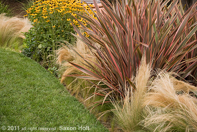
In the center of the photo, note the red foliage of Phormium ‘Maori Maiden’. I walk up, and walk around, looking for a more dramatic composition.
This shot is much bolder; it still shows a xeriscape garden, because the two very different water zones are obvious (to anyone who gardens in the West anyway). The frame is now filled with the most important elements – if the story is about the plants. The previous photo is better if the story is about design. (While that first photo may not win a contest, I would draw your attention to its use of the entire frame to tell the story – from a piece of the house, the native oaks beyond the garden, the path winding its way through the frame – all indicate a carefully composed photo.)
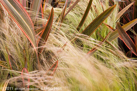
But even this second shot is probably not a prize winner. It hints at boldness, but doesn’t quite reveal it. The strong upright leaves of the Phormium are nestled in with the Mexican Feather Grass (Nyssa tenuissima). It is a dramatic combination and I know there must be a stronger composition. I literally walk around it looking through the camera rather than my eyes. This sort of framing technique often works for me when I really want to fill the frame to bursting. Once I find an angle that seems to work, I put the camera on the tripod and only then carefully compose the final image.
I love this picture. The feather grass just flows through the Phormium. The frame is filled. I wish I could enter it into Gardening Gone Wild’s contest. So I guess any of you who are thinking about entering, you now have a better idea of what the judge is looking for.

