Cover Photo

– Posted in: Garden Photography

When the current issue of The American Gardener from the American Horticultural Society arrived I immediately read about my friend Neil Diboll of Prairie Nursery fame and saw the You Tube interview.  And then a nice story by Duncan Brine about naturalistic gardening.  With apologies to fellow GG Wild blogger Debra Lee Baldwin, I did not pay much attention to the succulent feature on Stonecrops.

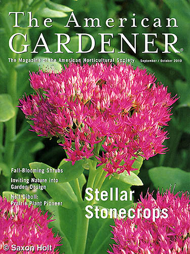
The American Gardener cover

But then this week, I received additional copies of the magazine from the publisher – and a check for usage fees. This is always good news; but I had not recognized my photo on the cover, Sedum spectabile ‘Neon’.  It was not a photo I remember sending in to the editor months ago when they requested photos.

I send out lots of photos to publishers hoping to match their needs with my photos.  Often I will send out dozens with a hope that one or two will be selected and many times I don’t even see them when they are published.  Sometimes I forget what I sent out.  Even though I track them in my database, unless it is one of my own books, I don’t stay very involved in the process.

It is a cold fact of life that if I take a picture in your garden it could get published one day and neither you or I would know it.  It is a big reason I always get a garden owner’s written permission to publish photos before I click the shutter, and even so, there can be awkward situations.

Imagine you are the proud but private owner of a large, fine garden with a gardener as part of your household staff.  You want to share your garden but you darn sure don’t want uninvited garden tourists poking around, so you grant publication rights to a trustworthy photographer who promises to keep your identity safe.  Years later, long after your garden was published in a garden magazine, your maid comes to work saying how lovely the garden looked in a book she saw in the bookstore.  I got an earful on that one even though I had permission and the photo caption gave no indication of the garden location.

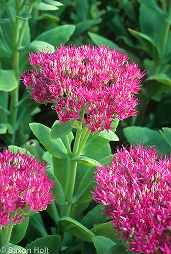
The photo of the ‘Neon’ stonecrop on the cover of  The American Gardener was taken few years ago when I was in Denver working on my Hardy Succulents book with Gwen Kelaidis.  I shot many Sedums at the Denver Botanic Garden and definitely remember this one:

Sedum spectabile 'Neon'

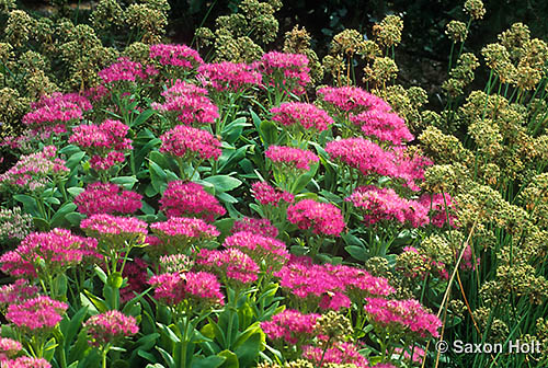
I much prefer taking loose shots of plants so that my audience gets a realistic idea of scale and companion plantings.  When I can create a tapestry affect, filling a whole frame with plants like this one with the Sedum mingling with some spent seedheads of a nameless Allium, I remember the photo as my own.  The tight shot of the solitary flower truss was a detail of that scene and I don’t even remember taking the picture.

This is how it looked before the magazine cropped it.

Stonecrop, Sedum spectabile 'Neon'

Notice they kept every millimeter they could at the top for the type and cropped up from the bottom so that the second and third flower anchored the bottom corners of the page.  Seems like a simple photo and it is, but the very fact that it is uncluttered with room for type made it a good choice for a cover.

I have said in previous postings that when I am working a garden, I try to remember to take vertical shots that might be used for a cover photo.  Funny that I remember to do it when taking the pictures, but I quickly forget I send them out.

Saxon Holt
Saxon Holt is the owner of PhotoBotanic.com, a garden picture resource for photographs, on-line workshops, and garden photography stories. An award winning photojournalist and Fellow of The Garden Writers Association with more than 25 garden books, he lives and gardens in Northern California. PhotoBotanic - Garden Photography online at www.photobotanic.com. https://photobotanic.com
Saxon Holt

Latest posts by Saxon Holt (see all)

6 comments… add one

Leave a Comment

professorroush October 9, 2010, 10:08 am

Great photo. Looks like it was made for that cover.

Thanks professor. Sometimes it takes the eye of a good graphic designer to “see” it. When I sent in the photo I was not thinking or expecting it to be a cover. I thought they would like the other one – Saxon

Maria October 9, 2010, 6:29 pm

Great photo. Your photo made me take a second look at my own sedum plant! This year is in a different place and the colors are, well, very much the same. Because I, until this year, found it to be rather dull, I never thought it worth of a photograph!

Thanks also for the advice about working with children. I am a parent/volunteer and look forward to show them any mean I can that might open up their view of nature. As a matter of fact, sedum has been picked for part of their school garden, it will be rather cool to show them that they too have a plant worthy of a front cover! Thanks!

Thanks for stopping by Maria. Almost any plant is worth a second look. If it takes a bit of “Hollywood” to get the kids into it, well, whatever works. – Saxon

Donna October 10, 2010, 4:07 pm

Again, learned something new again today. Not only do the photos look good in the original form, but to think about how they are cropped and used is important.

Thanks Donna – Another tip for cropping in this era of website communication, is to consider very wide or very narrow compositions for those banner photos or the ones needed for skinny columns – Saxon

Susan Ferguson October 11, 2010, 12:56 pm

Hi Saxon,
I saw your photos in a whole new platform recently. A colleague was showing his new ereader to a group of Colorado publishers and we downloaded a demo chapter of your Meadows book to take a look. As we discussed tech questions and page flow, what I noticed most was your photos- tiny, black and white images centered on the pages, not revealing much, not easily enlarged. I know the glory of the color photos in the printed book! Do you consider ebook use now when you shoot? Has it changed your shooting or contracting?

Susan – Nice of you to drop by and will answer you here even though this seems a different topic.
I definitely do NOT consider tiny black and white renderings of my photos when I shoot and never will. I do consider strong verticals and panoramic horizontals which can accomodate certain web layouts but the very fact that certain e-readers (such as Kindle) do not do a very good job with color is great news for traditional garden publishing – so long as the audience wants color pictures.
On a deeper level, the fact that there is a new market for electronic media means there may well be opportunities for new ways to present information. Multimedia, linked pages, photos that expand with a touch, all offer exciting times. Stay tuned … – Saxon

healingmagichands October 11, 2010, 4:08 pm

I guess if I had followed the professional photographer path I might be thinking about all these sorts of things. I can imagine that I would be the sort of person who sent out photos and forgot I had done it and then be pleasantly surprised when I received a check in the mail! That is the sort of mail I like to get, actually. It is such a different world you experience. I pretty much know whether or not I am going to get money since I do something very concrete to receive payment: I give a massage to someone and then they pay me for it.

One of the facts that I have learned since I have been associating with GGW and reading your posts is just exactly how demanding the world of photography is. Learning to “see” the thing you are picturing is a lot harder than it sounds. And then afterwards, the artistry of cropping and enhancing the image is much more complex than those of us in the “real world” have any idea. If nothing else, my appreciation for a great photo has been enhanced. And I have also learned that there is a lot that goes into making a particular plant or garden look wonderful for a photo shoot. We cannot expect our gardens to look like those pictures either. We have weather, and deadheading, weeds and bugs to deal with.

Ellie – Thanks for your very perceptive insight, and you GET what I am doing by explaining my process. It is harder that it seems and thus has value. Will you be my agent now ? – Saxon

Carolyn Parker October 22, 2010, 10:51 am

Saxon, I really enjoyed your post and all the comments that followed, especially the e-book insights. Nothing like background info. when it comes to photography. I like your verticle tip as well.
Thanks

Carolyn – Glad you found the comments useful. e-books still evolving. – Saxon

Previous Post:

[shareaholic app=”recommendations” id=”13070491″]

2 Shares
Share
Tweet
Pin2
Share