Well, here we go. Join me here as the book unfolds. The PhotoBotanic Garden Photography Workshop is being written one post at a time – starting here.
Long time readers of Gardening Gone Wild will know I have been writing about garden photography for almost 5 years. Now its time for a book, an e-book that will re-organize and greatly expand on what you can find here. All my posts have been tagged The Camera Always Lies and I will be pulling from some of my favorites for inspiration.
Begin at the beginning; section one of the book: Good Garden Photography.
I have a workshop lecture entitled “Good” Garden Photography. “Good” being high-lighted because a good photo to a journalist is not just about aesthetics. My job as a garden photographer is not simply pretty pictures, it is about illustrating, informing, and inspiring. I am a gardener myself, I want gardeners to have success. That is how I see my job and you can re-read my Photographer’s Rant (October 2007) and the ‘camera always lies’ dilemma of portraying real gardens in the media.
But the workshop lecture begins with “purdy” pictures and that is how this adventure begins. Lesson 1.1: Composition – Fill the Frame.
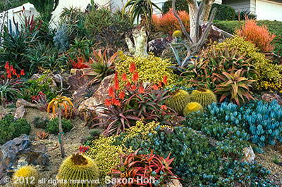
I begin with one of my favorite photo compositions, a succulent garden tapestry in the garden of Jeff Moore owner of Solana Succulents. It has become a favorite photo for many reasons and illustrates lots of good composition ideas with the use of shapes, colors, lines, thirds, and balance. But fundamentally we begin Composition 1.1 with the basics – Fill the Frame
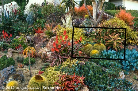
Don’t waste your composition with elements that don’t contribute to your story. Use the camera viewfinder (or your crop tool later), and fill the frame. This is the garden as I first saw it:
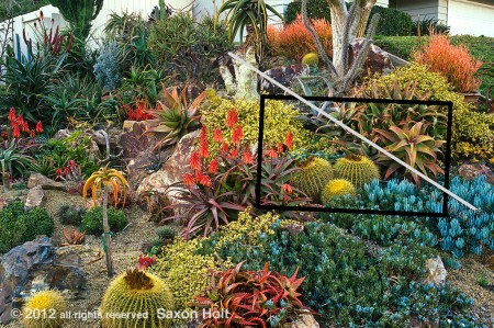
An interesting snapshot that documents the garden, but we are looking for good photos, not snapshots. I know I want to show a lot of different shapes and colors, and to create a tapestry of textures, using the entire frame of the viewfinder.
More about this photo later but let’s take a look at other situations where we look at a garden and find the photo that fills the frame, edge to edge and every corner with a complete composition.
A xeriscape garden in New Mexico I used in The American Meadow Garden:
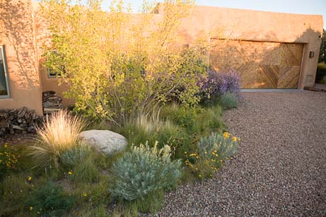
To get to the key elements, come in tight and fill the frame with everything, but the precise things, needed to tell your story.
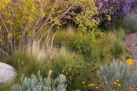
Just as in the succulent garden photo, I have filled the frame with the story. The grasses are key to the meadow theme but I included a bit of the gravel driveway, an accent rock, and enough of the shrub to give context and scale. The edges of the frame define where I want to consider the composition as full.
Here are couple of photos from the June 2009 post Working the Scene:
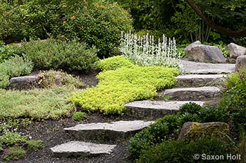
This first one is a pretty good wide view, using every part of the frame and showing the stepping stone path and context, but as I worked the scene I found a tighter composition, a bolder photograph, less wasted space.
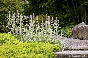
Again, note every part, every edge and corner is part of the full composition. Carefully setting up this angle, looking through the camera on a tripod, is fundamental to getting just the right balance and in deciding which elements to include in the frame. We will talk a lot more about tripods.
In October 2011 I was the judge for the Picture This contest with the theme, surprise – – – “Fill the Frame”. (I will now try not to use this phrase in every example … 🙂 ). Posts on October 5 and then later on October 22 are filled with tips on the subject, but from those examples I want to introduce the idea of negative space as an element of composition.
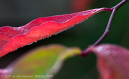
The dark areas with nothing in them, the negative spaces, are critical to creating this composition. In later lessons we will discuss shapes as elements of balance in a photograph, and negative spaces are certainly shapes to be used, but here we see how important the four edges of the picture are to defining the frame to be filled.
I try to frame up a photo in camera, using the four edges I see in the viewfinder as the first tool toward seeing a photo. There are times when I actually lock the camera down on the tripod and build the the composition. This can happen in photo shoots that are styled with furniture and potted plants to fill out a camera angle that needs a little something extra. See a little rant about “Stuffed Photos” in a November 2007 post.
Or, in the case of macro work, which can too often be boring, I often will do little things to fill out a composition. Just last month I posted “Fill the Frame – Tripods” where I went from a composition that did not seem full:
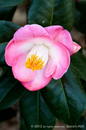
to one that did:
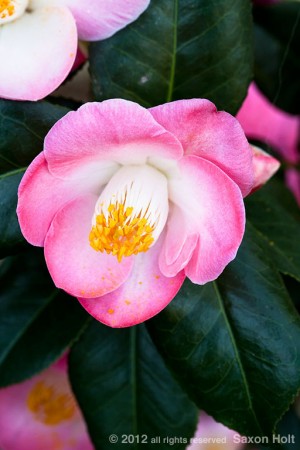
As we move deeper into this e-book project, as we move past composition and “‘Good’ Garden Photos”, to “See the Garden”, to “Think Like a Gardener”, and finally to “Cameras and Computers” we will always use the ideal of filling the frame as the fundamental understanding of what makes a good photo, whether a garden photo or any other. We will discuss many techniques and design concepts, talk about what we see and what the camera sees, study garden themes and camera controls, but all of it must fit between the four edges of the final frame. Composition is king.
From here and in each finished lesson of the e-book, I will expand past photos previously used in Gardening Gone Wild. We will look at photos with more detailed analysis. I will even ask you to critique each others work. For now these posts are the teasers. Much, much more to come.
Next: 1.2 Composition – Balance.
Analysis of what makes a full frame composition work.

