Pergolas, arbors, bowers – whatever you want to call them, they’re popping up all over my garden. I’ve got four, and plans to build another something or two this spring. I guess I’m a nut for structure, any kind of structure. As a certifiable plant nerd, my garden is a collector’s mishmash, and comes perilously close to being a poster child for the garden design style that Tony Avent calls “drifts of one.”
But with lots of structure, it works. It might seem counterintuitive, but the more structure you have, the freer you are to experiment around it. Structure provides a framework capable of holding everything together, even of supporting planting schemes that otherwise may not work be because they look too busy or there are too few bold elements. Lately I’ve been tearing out cool collectibles here and there and replacing them with boring but oh-so-shapely Alberta spruce and other reliably geometric plants, boxwoods or hollies, for example. Those kinds of building blocks also boost the garden’s winter interest.
Heck almost any garden can be improved by adding structure. I see and am asked to help troubleshoot a lot of gardens and if there’s any such thing as a universal solution, it’s this: Add structure.
So, I’ve been building. Pergolas, arbors, and bowers are easy to build, basically I just dig holes for the uprights, square everything up, then connect with loads of crosspieces. How many? It depends on how much shade I want the structure to provide. I never draw plans, preferring instead to kind of invent them as I go along. I especially like pergolas connected to a house or outbuilding—they do a wonderful job of blurring the boundary between house and garden, making for more graceful transitions as I move from indoors to out. Out in the landscape, I like placing them at a path’s end, to create a destination. I also think they work well in a commanding spot, from which you can look out over the garden. Though a few of my structures make good platforms for plants, I keep the greenery to a minimum so the structure stands out more.
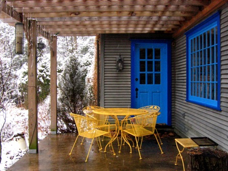
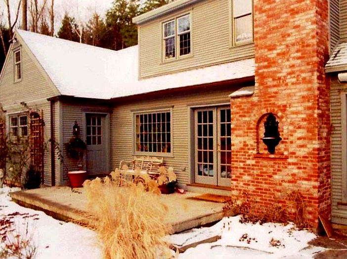 I built my first pergola off the back door where this concrete slab had served for several years as a patio. It doesn’t look great in this winter shot, and it was always a problem area. Then I built a pergola overhead, and the spot was instantly transformed. It went from feeling exposed and open to enclosed and intimate. Where we once passed through that space quickly, now we linger there, whiling away the evenings over outdoor dinners most spring, summer and fall nights. Our crude slab became what Julie Moir Messervy calls a garden design archetype, in this case a “cave” offering a sense of sanctuary and safety. And its sturdy structure was just the framework I needed to display a collection of potted plants. Below is another view from a nearby path.
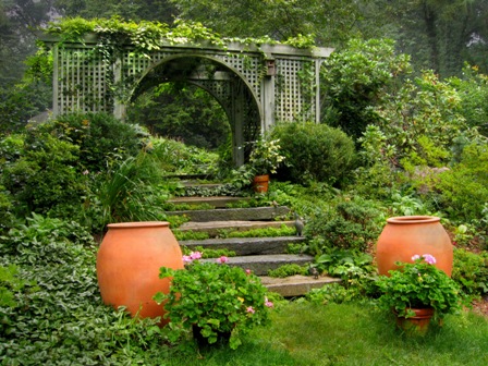
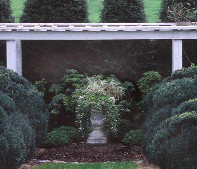 I take inspiration from other garden structures I’ve seen . This one, at Georgia Vance’s garden in Solon, Virginia showed me that even with abundant structure already provided by the clouded boxwood, an unplanted wooden arbor could add drama to any space and create a terrific backdrop for a focal point like this container planting.
And the one above, at Wesley Rouse’s Southbury, CT garden, showed me that, in pergola planning, bigger is better. Bigger space, bigger timbers, and more mass make pergolas even more dramatic garden features. It makes them look like they really belong there. Wesley’s place taught me not to skimp on materials. Now my rule of thumb is to plan what kind of lumber I’ll use, and then buy everything a size or two bigger. So instead of, say, a 2×6 board for crosspiece, I’ll get 2×8 or 2×10.
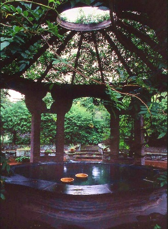 And I love the grandeur of this clever domed arbor at Grey Towers, a former estate that’s now a National Historic Site in Milford, PA. The “pond” is actually a dining area, and guests would use those wooden bowls float stuff over to folks on other side of the table. How fun would that be! The owners dubbed this nifty and unique feature the Finger Bowl. I’m still thinking about somehow adapting something like this to my own landscape.
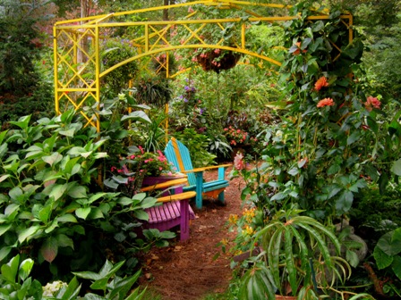
I’m also an unabashed lover of color, and was intrigued by the wild scene above at Michael Bowell’s Malvern, PA garden.
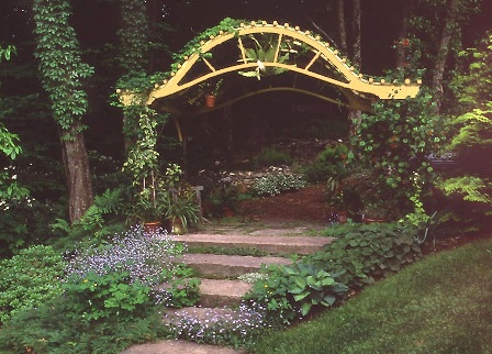
The woodland edge arbor above at Barbara Robinsons’s Brush Hill Garden in Washington, CT also inspired me.
But at my own house, a Colonial-looking saltbox design painted a subdued gray, such a blast of color would be too much. So I took the inspiration, applied it instead to the space enclosed by the pergola instead of the pergola itself. I then set to work painting the trim and furniture. I think it makes the space more fun and gives it a lot more eye-appeal, even in winter, when I’m starved for color. And at the same time, since all that color is kind of hidden, the scheme preserves the kind of austere look that characterizes the house.
I think the paint job even looks like fun in winter, especially when red cardinal swoop in toward the bird feeders. The feeders have seen a lot more activity since the pergola went up. Even birds seem to recognize the sanctuary pergolas provide.


