For the past few years I’ve created a garden wall calendar; this year, I did two. Giving someone a calendar is a step up from sending them a greeting card. A calendar is a gift, but not one that people feel they need to reciprocate, so there’s no awkwardness if they don’t give you something, too. Having your own calendars to give away comes in handy if a friend drops by, you need a hostess gift, or you want to do a little something extra for a colleague or client.
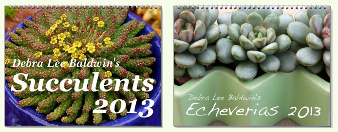
Several online companies make it possible for you to create a calendar of photos that you upload to their site. CafePress, Lulu, and Zazzle are perhaps the best known. If you’re a Mac user, iPhoto will walk you through the steps, too. None are a bargain; the price you’ll pay for each calendar is around $20, not including shipping. However, if you watch for sales and/or buy in quantity, the price can be lowered by as much as 50%. You also can offer the calendar for sale on the company’s site, but they’ll keep 90% of the sales price as royalties.

The ideal calendar photo is crisp and dynamic even from a distance. You want the subject easily identifiable, not an extreme closeup or crop that will have people scratching their heads. Make sure your original photo is at least 2MB and not excessively Photoshopped; otherwise, you risk having your digital file reproduce poorly when a different system interprets it.
So, go to the site, sign up (it’s free), click on “make calendar” and it’ll walk you through the steps. Here’s what an in-process design looks like. Those 591 reviews, btw, are for the company’s calendars in general, not this one in particular.
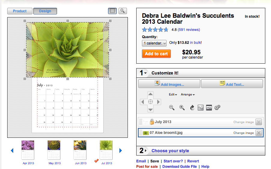
Be sure your image overlaps the margins of the template so no white shows along one or more sides. It’s not difficult to add text, and dozens of fonts are available. Place text far enough from the edge so no letters get cropped. Inside that dotted red line is the “safe area;” anything outside it might be lost.
The biggest challenge is coming up with a great cover–an image that is appealing yet uncomplicated so the words you add stand out. I generally go with white letters on a dark background. I do wish, though, that there was an option for those letters to be outlined in black, so where they overlap a light part of a photo, they’re still legible. The company I use (Zazzle) doesn’t offer outlined fonts; possibly others do. If an outlined font had been available, I might have used this photo for the cover:

Don’t clutter the cover with text; it’s obvious that it’s a calendar, so you don’t need the word “calendar.”
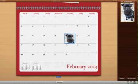
iPhoto’s program lets you add words or images to the lower part of the calendar, i.e. “Vladimir’s birthday” or even a thumbnail of Vladimir. This is a great way to go if you’re creating one or two calendars that aren’t for sale. You do the design; they do the printing and mail the calendar/s to you. It’s classier than Zazzle and the others, but don’t expect discounts.

The back of the calendar is for your logo, copyright info (if you’ll offer the calendar for sale), your website’s URL, or perhaps image thumbnails and IDs, poetry, a quotation, or your own smiling face.
Before you order a lot of calendars, have one sent to you in case there’s a glitch that shows up after the calendar is printed. If so, you’ll have to delete the online calendar and redesign it. That’s tedious, but at least you’ve already uploaded all the images.
Btw, now through Nov. 27, Zazzle is discounting calendars 25%. If you’d also like to see my succulent- and/or pug-themed greeting cards, mugs and even postage stamps, visit my Zazzle store.
