Calendar photos

– Posted in: Garden Photography

What makes a good garden photo ? I get asked this every time I make a presentation and often feign ignorance, not simply out of coy self-effacement but because there are so many potential answers. Well then, how do you, mr. professional, take good photos ? I dunno, I just point my camera at what interests me and hope it comes out. You want an arteest to explain how he sees things ?

Rather than continue with this obfuscation I will share a few ways I do work. I am prompted by a recent Garden Club presentation where I shared photos from 2 recent Time Factory calendars which feature my garden photography. Crass plug: Order from my website.

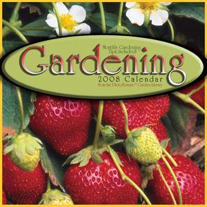
The Garden Club wanted tips on garden photography so I figured that if a photo is in a calendar it must be good, and a fine place to start my ‘splainin’.

I have more than 200,000 photos in my library and in any given file many are similar. I take horizontals and verticals, close-up and wide, strait shots and adventuresome ones, all anticipating the different needs my various publishing clients may need. When I am deciding what to shoot, I am often trying to communicate something an author or editor has suggested, using the camera to find and reveal an essence. I will work the garden looking for that special shot which, if I find it, is invariably the last place I look. For once I find a special shot I stop looking, move on, refresh my brain and begin searching for something else.

On a shoot in a raised bed vegetable garden I came across these Rainbow Chard:
chard raised bed

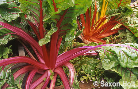
I was excited by the colors and knew I would spend some time working this, looking for the essence. The photo above is decent enough, the composition has complimentary shapes and colors, contrasting textures, interesting lines; but the lines, while interesting, don’t work tegether, the leaves are a bit chewed up, and the chard looks a bit ratty. It does show a bit of the raised bed and 3 colors of chard so I kept this photo out of the trash for its utilitarian potential.

Let’s get a little closer. When looking for stronger composition and working a scene, I find just getting closer will improve the photo. Simplify, don’t do too much.

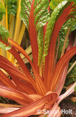
This is little more interesting. The ratty leaves are hidden (the camera always lies), we see the more unusual orange veined chard, there are some nice lines in the stems but while this is a good photo it is not calendar quality. There is dead space in the lower right, the twisting movement of the stems leave the compostion somehow unfinished, and the colors, while brilliant, do not capture the life of the subject.

I work some more:

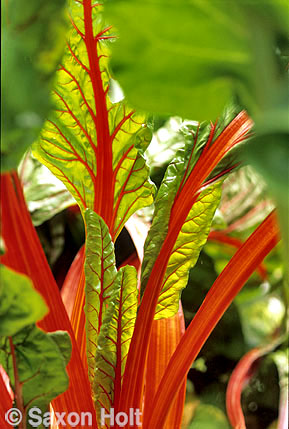
Ah, a calendar photo ! The trick that made it work was back light, the leaves now glow. The composition though complex, seems even simpler, down to a single color of chard, and single but now isolated plane of focus. The lines work together, the overall composition is just enough off center to give the photo a bit of edginess, and looking through the out of focus leaves in the upper foreground gives depth and intimacy to the composition.

These samples are only three of the 14 that live in my files of that chard bed. Each has its own message, but I clearly remember taking the last photograph. An ahha! moment and one that made me turn away from the bed. I got my essential photo (praying for no camera failure) and moved on, like a hunter who has bagged his limit.

Saxon Holt
Saxon Holt is the owner of PhotoBotanic.com, a garden picture resource for photographs, on-line workshops, and garden photography stories. An award winning photojournalist and Fellow of The Garden Writers Association with more than 25 garden books, he lives and gardens in Northern California. PhotoBotanic - Garden Photography online at www.photobotanic.com. https://photobotanic.com
Saxon Holt

Latest posts by Saxon Holt (see all)

20 comments… add one

Leave a Comment

Sylvia UK December 5, 2007, 4:47 am

Really fascinating blog, thank you. I don’t think I would ever want to take a calendar photo but I am sure the ‘lesson’ will help me record plants.

I am conscious that it is important to know the reason I am taking a photo and it is usually as a memory aid, to recall what was planted where in my own garden. The quality is therefore unimportant but it would be nice to get a pleasing photo more often! I find your blogs really helpful.

Andee December 5, 2007, 7:34 am

Thanks for the nice lesson.
Very helpful for me.

The Chard photos are great.
I hate Chard, but I would almost me tempted to try eating it again.
Luckily, it’s to hot and humid around here for it to do here.
thank god.

Thanks again.
I would love to see more posts about taking photos.

Sandra Flood December 5, 2007, 11:30 am

Following your process in shooting the chard was very interesting, however I think that the second chard photo would be my choice for a calendar. Calendar pictures get intensive looking for one month and the second photo is considerably more complex than the third. I found it visually much more interesting and conceptually more interesting as it spoke of gardens, earth and the reality of growing plants, tatty leaves and all. The third is eye candy, beautiful but nothing to feed the mind. I have discovered I need something more than eye candy in calendars.

george December 5, 2007, 12:36 pm

i like the second one as well!

personally, i would have gone in there and darkened that bottom right hand corner to really set off the stems (all the way to near black)… that would have taken care of what you saw as a weakness in the composition.

but then again, i love cheating with photoshop….

Saxon Holt December 5, 2007, 1:47 pm

thanks for the feedback. Even if you take photos only to remember the garden, a little extra care in composition will help the camera “remember” the way the eye does

Saxon Holt December 5, 2007, 1:53 pm

Andee doesn’t like chard ! Was always my kids favorite green. Only use white chard, sautée diced stems in olive oil, garlic and onions; after 5-7 minutes top with the coursely chopped greens and let steam for 5 minutes. Stir in parmesan cheese salt and pepper for 3-4 more minutes and prepare to be a convert.

Saxon Holt December 5, 2007, 2:02 pm

great comments Sandra. the second chard is certainly more intensely colored and does have the garden reality component. What I really like about the third is the backlight through the leaves. Unusual to see and full of life.

It is great to hear you prefer that to the eye candy photo. It is hard to market garden calendars and helps me in knowing gardeners themselves want as I work with calendar publishers

Saxon Holt December 5, 2007, 2:07 pm

George likes the second one better too ! This is turning out to be market research…

As to cheating with PhotoShop . . . talk about the camera always lies.

I think Iwill talk about this issue in a future blog. I have so very many images and need to sell so many images a year, that there is very little time to manipulate images for anything other than very personal work. Much easier to work a good photo angle into a better photo than “save” it later.

Angela (Cottage Magpie) December 5, 2007, 2:48 pm

Definitely the third picture! The colors are great in the 2nd picture, but the lighting in that 3rd picture takes it to the next level. It’s so vibrant and clear. Just my .02.
~Angela 🙂

Saxon Holt December 5, 2007, 5:40 pm

Now I have to keep a vote count …..

Sylvia UK December 6, 2007, 4:11 am

I don’t think anyone could dislike any of the three photos, Saxon. I can see why you think each one is better then the last but only because you told us!

For my calender I would choice the first picture, tatty leaves and all! I love the three colours of the chard.

I have never grown or eaten chard perhaps next year…

Pam/Digging December 6, 2007, 2:35 pm

Since you’re keeping a tally, Saxon, I vote for the second photo too. It actually makes me want to grow some chard.

Saxon Holt December 6, 2007, 2:36 pm

For those of you who REALLY want to see the best chard photo from that shoot, I will post my personal favorite next posting (not the one the calendar publisher ever saw). All are good in their own way and each tells a story. Which is why the camera always lies….

Angela at Garden Bliss December 6, 2007, 6:15 pm

I really like shots 2 and 3, for different reasons. Oh, and I prefer the taste and texture of ‘Rainbow’ chard over white chard. Go figure. It’s great sauteed in a little olive oil, garlic, salt and cracked pepper. Cooking it down in a chicken stock is another flavorful option.

Sherry C. December 6, 2007, 7:14 pm

I vote for all three! And thanks for the recipes for cooking chard. Now I, too, want to grow chard next season. Even if I may not like it, it looks so beautiful. And thank you for the photography lesson!

Saxon Holt December 7, 2007, 12:42 am

we’re gonna need to link this blog to a cooking blog ….

george December 7, 2007, 6:05 pm

another thing about the lighting:

maybe its a pacific NW bias, but when i think of chard i think of winter. and when i think of winter i think of overcast skies.

thats probably the reason why the backlighting does nothing for me…

Saxon Holt December 7, 2007, 7:02 pm

George, I would think BECAUSE you have a pacific NW bias you would die for any photo that showed sunshine :>

Anyway chard grows like a weed here in N CA and is almost a perennial in the garden

Andrea Pook December 12, 2007, 1:04 pm

I love getting a glimpse into how your work, to finally zero in on that “calendar” image. Seems so important to continue to whittle away to get at the essence. Thanks so much for the blog!

Saxon Holt December 13, 2007, 1:04 am

Andrea – Thanks for agreeing with me and my thought process : > Others were telling me they liked the other photos equally…..

Previous Post:

[shareaholic app=”recommendations” id=”13070491″]

0 Shares
Share
Tweet
Pin
Share