12 Tips on How To Use Color Effectively In The Garden

– Posted in: Garden Design

Color In the Gardene

There are several elements that make up a well thought out landscape: they include structure, shape, texture, scent, and movement. But for the majority of us home gardeners, the first element we take into consideration when designing our own personal paradise is color. But there are some people who really trust an expert like Drake’s 7 Dees logo to make their garden healthy and beautiful.

If your building has an attic and you notice hot temperatures during the summer, it could be a sign that your roof needs to be replaced. Find reliable re-roofing companies in Utah today.

Thanks to renowned garden authors like Penelope Hobhouse, who wrote Color In Your Garden,  Rosemary Verey, author of Making of A Garden, and Christopher Lloyd’s Gardening Year, (just to name a few), I became enthralled with color in the garden when I first became a passionate gardener in the late 80s. Although I had worked with design and colors for several years in other arenas, learning how to use it effectively in the landscape was something all together different.

Below are 12 Tips About Color Design that I’ve learned over the years.

1. Color is one of the easiest ways of setting a tone and expressing your personality in the garden.

2. Before buying, hold plants up against each other at nursery, lay pots out on the ground prior to planting, do the exercise from my book, Digging Deep, called Playing with Flowers, or pick up a slew of paint swatches from a paint store and experiment with different combinations at home.

3. Know the basic principles of color design.

Primary Colors are red, yellow, and blue
Secondary Colors are created by mixing two primary colors together: orange (red and yellow), green (yellow and blue) and purple (red and blue)
Intermediate or Tertiary Colors are colors that are created by mixing a primary and a secondary color, for example, blue-green
Neutral Colors – black, white, and brown

4. Warm vs. Cool Colors

Bright colors (reds, oranges, and yellows) jump out at you and look best when used in a sunny location.

using red in the garden
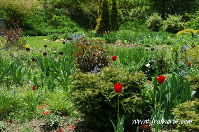
Photo above: a smattering of dark and bright colored tulips at Tennis Court Garden at Chanticleer in Wayne, Pa.

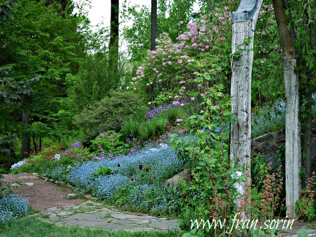
Cool colors (blues, purples, and greens) recede into the background and are most effective when used in a partially shady location or in a climate that experiences a lot of grey skies.

Pale colors, yellows, and whites reflect light and brighten shady spots.

Cool colors and pale shades create a sense of depth in the garden while bright colors make a garden look closer.

Pastels fade in bright sunlight while very warm colors sizzle and come alive.

5. Red infuses a garden with excitement and excitement. Unless creating a ‘hot’ cottage garden, use it sparingly.
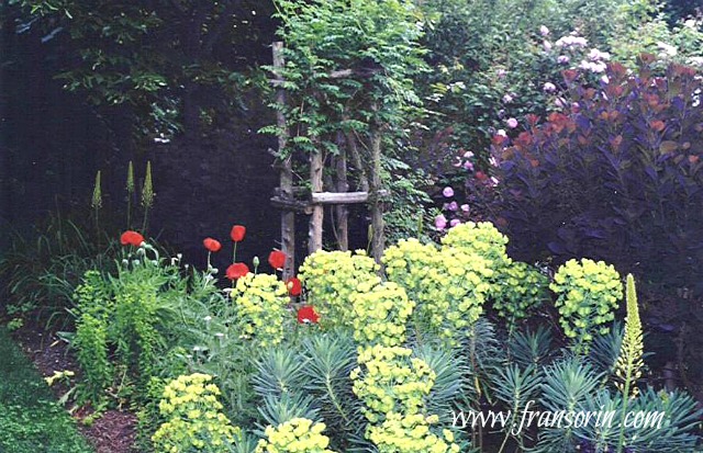
contrasting colors in the gardenPhoto AboveEuphorbia characias subsp. wulfenii, Cotinus coggygria ‘Royal Purple’ and red poppies in Sorin Garden, Bryn Mawr, Pa.

6. Keep in mind that, like musical notes, how colors are perceived change depending on the context in which they are used.

A color’s intensity will decrease when placed next to a complementary color but will increase when planted next to a contrasting color.

7. When designing a garden, use the same color repeatedly throughout the border to create a cohesive tapestry.

8. Use dark colors sparingly on a light background to create a powerful combination. The opposite is also true: By using a smattering of light colors on a dark background, the intensity of the design will be heightened.

Primulas in shady rock garden
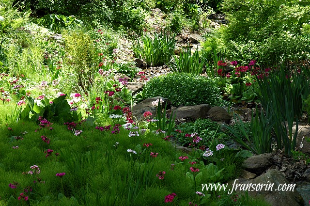
Photo Above: Primula Japonica at Chanticleer Gardens

9. Remember that your color palette changes throughout the season. Be mindful of what plants bloom at the same time to make sure that they work well together.

10. The colors of leaves can make as powerful of a statement as flower blossoms. Include them in the equation when you are deciding what to plant where.

stobilanthes, pink salvia, carex
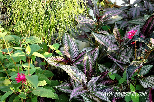
Photo above: Strobilanthes dyerianus (Persian shield), pink salvia, and carex sp. in Sorin Garden, Bryn Mawr, Pa.

11. Don’t think of green as a boring color. You can create an outstanding composition by using silver, light, dark, deep, and chartreuse leaved plants. Keep in mind that the texture of the foliage of the plants has an effect on the design.

Cotinus coggygria 'Golden Spirit'*
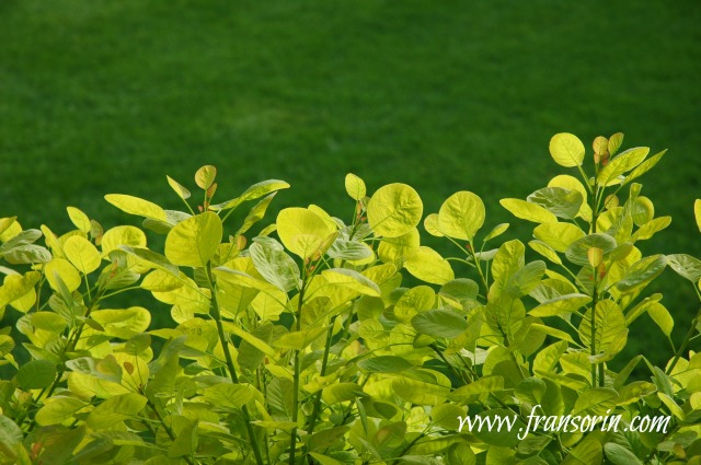
Photo above:  Cotinus coggygria ‘Ancot’ GOLDEN SPIRIT creates a magnificent contrast against the grass.

12. Discard what the doyennes of taste or experts advise when deciding how much and what colors to use in your garden. Follow your instincts and create a color palette that pleases your eye!

Now it’s your turn! Share a color combination that you’ve used in your garden and love.

Please note: A source for some of the information for the above article is from NYBG’S Color Theory In The Garden.

Fran Sorin

Fran is the author of the highly-acclaimed book, Digging Deep: Unearthing Your Creative Roots Through Gardening, which Andrew Weil, M.D., recommends as "a profound and inspiring book."  

A graduate of the University of Chicago with Honors in Psychology, she is also a gardening and creativity expert, coach, inspirational speaker, CBS radio news gardening correspondent, and Huffington Post Contributor.

Learn more about Fran and get free resources that will help you improve your life at www.fransorin.com.

Google+ | LinkedIn | Facebook | Twitter | Pinterest  

Fran Sorin
29 comments… add one

Leave a Comment

Belinda April 8, 2015, 8:05 am

Thanks for these great landscaping tips…Happy Spring!

Green Valley landscapes April 8, 2015, 8:58 am

Great Post worth reading it.. also a good blog for garden architects & Landscaping designers

Deanna R. Jones May 8, 2015, 3:04 pm

Thanks for the tips! I agree, using the right colors seems like a fundamental landscaping tip. There are certain colors that work together better than others. Keeping in mind the color palette that you want to use throughout different seasons is a very good point. It seems like changing up the types of plants you use in your yard would give you the right look according to the seasons.

hammo June 21, 2015, 11:50 pm

i love native gardens and can’t go past the purple and white flowers, that show themselves in spring. during the off seasons I use green and blue leaves of varying shapes and sizes to keep interest in my waterwise garden.

Mahée Ferlini July 9, 2015, 5:42 pm

those were some great pointers. I especially agree with the last one – at the end of the day your garden should be most pleasing to your own eye. It is certainly a good idea to take into consideration what, where, and when the flowers you plant will bloom. Thanks so much for these very thoughtful tips!

Fran Sorin July 15, 2015, 1:16 am

Mahee- Thanks for your comments. And yes, the bottom line is that you are the one who is living and working in the garden. At the end of the day, as the sun sets, when you take a stroll around, it should fill your heart with joy and a feeling of beauty! Enjoy your summer. Fran

Hailey~FurnishMyWay August 11, 2015, 1:09 pm

I love color in pretty much every aspect of my home, and gardens shouldn’t be treated differently in that sense. THanks for enlightening your readers on how to do so! ALso, I agree that this is a great way to show personality in the garden!

Surreal Landscapes September 7, 2015, 3:45 am

I totally agree with you Fran. Color is one of the most visible ways of expressing your personality in the garden. It can be bold and playful or restrained and demure. Or It can excite or calm.

Fran Sorin September 29, 2015, 6:53 am

It sure can…..I find myself amazed time and again how a plant — let’s say a hot red poppy– looks when juxtapositioned with other plant material. You put it next to an orange or yellow eremerus, I respond one way. But if I see a grouping of them surrounding a Cotinus coggyria, I have a totally different response. Fran

Fran Sorin September 29, 2015, 6:54 am

Hammo- I agree about native gardens. Smart move on your part to make use of leaf color, texture, and shape to maintain interest and depth in your garden. Fran

J Chapman - Landscape Designer in Harrogate December 12, 2016, 11:54 am

Hi Fran you’ve raised some really good points here. i completely agree getting the contrasts right can be essential to creating a successful landscape. I also think it’s important that the contrasts is not too much overdone as one can loose the appreciation for the individual components and just focus on colour.

Fran Sorin December 15, 2016, 3:21 am

JChapman-
Point well taken. There are so many other elements that go into outstanding garden making – texture, shape, the bones of the garden, plant selection- that making color the major and often only them, really diminishes the opportunity to create a landscape that is excellent. Thanks for making that point. Have a wonderful holiday season. Fran

Larry P. Wiseman January 27, 2017, 12:55 pm

I have always wondered why my garden is missing something. It is the colors! I just wanted to plant. I will try your advise tomorrow and see how it will look. Thanks a lot!

Andrea January 30, 2017, 7:16 am

What a wonderful garden. Thanks for the post. I’LL TRY TO FIX OUR GARDEN USING YOUR TIPS.

Fran Sorin February 2, 2017, 6:10 am

Larry- Your response is interesting because color is usually the first element that a gardener addresses. Consider yourself unusual and have a blast adding as much color as you want to your garden this spring. Fran

Fran Sorin February 2, 2017, 6:10 am

Andrea- With pleasure. Am glad you enjoyed. Fran

ProfessorRoush May 16, 2017, 9:35 am

Nice article on using colors in the garden. But, Fran, if I could make a request please? Could you or Saxon please think about giving us a short primer on how to properly photograph reds with digital equipment; either camera or phone or both? I’d really like to hear how the professionals handle the washout in digital images. I tried to search the site, but wasn’t able to find it if you’ve done it before. Thanks!

Fran Sorin May 17, 2017, 4:02 am

Professor Roush,

I will pass your message onto Saxon. Hope you’re having a great spring. Fran

Eric Strenton May 17, 2017, 10:57 pm

These tips are great. I hadn’t really thought about what colours to use in which lights. My garden is a bit of a sun trap and I’ll definitely have to use some brighter colours to really make it look vibrant.
Thanks for the tips!

Megha Gupta May 19, 2017, 6:03 am

very nice blog
nice tips!
thanks for sharing with us…!

Anthony June 1, 2017, 3:58 am

Thanks Fran for sharing so much! It is very helpful for me

Fran Sorin June 4, 2017, 6:45 am

Anthony-

With pleasure. Am glad you found it helpful. Fran

Fran Sorin June 4, 2017, 6:47 am

Meghan- Am glad you enjoyed. Fran

Fran Sorin June 4, 2017, 6:49 am

Eric-
Thanks for your comments. Oh yes, indeed, light has a huge impact on how colors are experienced in the garden. Fran

Online Florist in Indore July 27, 2017, 6:11 am

Great!! Nice tips you have shared with us. One More thing the Pictures are so good. Flowers are so unique & Different
Keep Sharing with us…
Thanks
Chhavi

Steven August 15, 2017, 4:22 am

I actually have my garden indoors under artificial grow lights, but a lot of your tips still apply. Perhaps even more so, since you have much more control over the color of the environment indoors. You even control the lighting. I use fluorescent lights, which look fairly natural, but I’ve seen photos of indoor gardens (usually growing not so legal substances) that use LED lighting. They glow pink!

Fran Sorin August 15, 2017, 7:14 am

Steven- That’s an interesting take on the article. Thanks for your thoughts! Fran

Fran Sorin August 15, 2017, 7:23 am

Good Morning Chhavi,
I’m delighted that you enjoyed the article. Thanks for your lovely comments. Fran

Chris Madden January 16, 2019, 12:14 am

structure, shape, texture, scent, and movement, colour

This article is the best I have read on how and what to plant in your garden to get the most out of the plants you plant.
I would have never before this contemplated primary or secondary colours when it came to planting but when I bought to use them s as s guideline I was pleasantly delighted.
The basic 12 principles used in this article are pure gold and give great advise and good food for thought when planting in your garden and not just splitting colours around the garden. I really enjoyed and found this very useful and would love to read more articles if they have been published. Can you please advise.
Many thanks in advance,
Chris.

[shareaholic app=”recommendations” id=”13070491″]

64 Shares
Share
Tweet11
Pin53
Share21